Margaret Calvert
description: English graphic designer and typographer
5 results
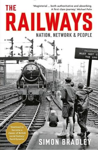
The Railways: Nation, Network and People
by Simon Bradley · 23 Sep 2015 · 916pp · 248,265 words
, finally doing away with regional colour-coding. The signs were lettered in the Rail Alphabet, a sans serif typeface designed by Richard ‘Jock’ Kinneir and Margaret Calvert. After a spell at the DRU, Kinneir had set up his own design practice in 1956. One early commission was the signage for the new
…
–5, 529 Busby, Matt 226 buskers 68 butter 346 C CAF 250 Caledonian Railway 30, 203–4, 479 Caledonian Sleeper 249–50 Callaghan, James 217 Calvert, Margaret 504 Cambrian Coast route 305 Cambrian Railways 357, 366–7, 459 Cambridge 95–6, 100–1, 220, 413, 448, 507 Cambridge–Haverhill line 458–9
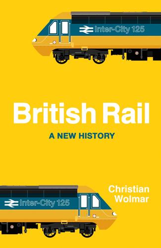
British Rail
by Christian Wolmar · 9 Jun 2022 · 337pp · 100,260 words
stations. The new font was another success. Rail Alphabet, a sans serif typeface based on the Swiss Helvetica lettering, was created by Jock Kinneir and Margaret Calvert. The two designers were also responsible for the font used on the much clearer road signage that was being introduced around the same time, as
…
Buckton, Ray 218–19 bus services 190–91, 226 bustitution 96, 146, 149 Butler, R. A. 62 Cab Secure Radio 296 Callaghan, Jim 149–50 Calvert, Margaret 110 Campbell, Ian 171 camping coaches 50–51 Cannon Street station rail crash 297 Capitalcard 281–2, 283 Captials Limited 35 car ownership 56, 78

Digital Transformation at Scale: Why the Strategy Is Delivery
by Andrew Greenway,Ben Terrett,Mike Bracken,Tom Loosemore · 18 Jun 2018
for digital transformation are not new. The UK government has achieved some proud moments in design, for example (Henry Beck’s famous Underground map and Margaret Calvert and Jock Kinneir’s work on road signs in the 1960s37 were both emulated worldwide), and couldn’t have done that without employing people who
…
and expert communities. * * * 36 http://mikebracken.com/blog/on-policy-and-delivery/; Institute for Government, October 2014. 37 http://www.britishroadsignproject.co.uk/jock-kinneir-margaret-calvert/ 38 Leisa Reichelt, http://www.disambiguity.com/alphagov/ 39 http://www.literacytrust.org.uk/adult_literacy/illiterate_adults_in_england 40 http://contentdesign.london/home
Concretopia: A Journey Around the Rebuilding of Postwar Britain
by John Grindrod · 2 Nov 2013 · 578pp · 141,373 words
mess, there was at least one development that injected a dose of elegance, coherence and practicality into the motoring scene. Graphic artists Jock Kinneir and Margaret Calvert, fresh from working on the signage at Gatwick Airport, had been commissioned by the government in 1957 to produce standardised signage for Britain’s fast
B Is for Bauhaus, Y Is for YouTube: Designing the Modern World From a to Z
by Deyan Sudjic · 17 Feb 2015 · 335pp · 111,405 words
world would look very different. Without modernism, Britain’s contemporary domestic landscape would be an entirely different place. We would not have Jock Kinneir and Margaret Calvert’s elegantly rational road signs, or the double-arrow logotype with which British Rail displaced the heraldry of its predecessor, British Railways. Britain is a