Globalists
by Quinn Slobodian · 16 Mar 2018 · 451pp · 142,662 words
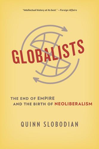
: one of the newer paintings that decorated the WTO’s walls, from the Danaé World Suite, 2001 by Jean-Claude Prêtre. The painting shows a Mercator projection of the world beneath a grid of crosses and flecks of colorful paint. Barely visible underneath are the outlines of the continents. The image suggests
PostGIS in Action, 2nd Edition
by Regina O. Obe and Leo S. Hsu · 2 May 2015
rolled around the globe, imprinting the globe on its surface. Then you unroll it to make it flat. The most common of these is the Mercator projection, which has the bottom of the rolled cylinder parallel to the equator. This results in great distortion at the polar regions, with measurement accuracy better
…
regions near the poles look huge. The measurements you get from them are nothing less than cartoonish, depending on where you are. The most common Mercator projections in use are variants of World Mercator (SRID 3395) or Spherical Mercator (a.k.a. Google Mercator (SRID 900913)), which is now an EPSG standard
…
and other output functions of PostGIS geometries will work fine with geography without any change. 3.2.3 Mapping just for presentation Although the basic Mercator projections are horrible for measurement calculations, especially far from the equator, they’re a favorite for web mappers because they look Licensed to tracy moore <nordick
…
to in the spatial_ref_sys.proj4text field. For example, you’ll see a proj4text entry start with proj=utm to denote a Universal Trans Mercator projection. Once you’ve figured out these pieces, the next thing to do is match your source to an SRS defined in the spatial_ref_sys
…
.info INDEX MapServer (continued) security 451 WMS and WFS 452–454 Mapzen 483 MAX function 507 measurement functions 158–161 geodetic 160–161 planar 159 Mercator projection 68 metadata setters 196–197 world files 196 methods DescribeProcess 119 Execute 119 GetCapabilities 119 GetMap 119 Microsoft Excel, importing with PL/Python 430–432
…
459 UNION 504–505 and bounding boxes 237 misuse 505 versus UNION ALL 353 UNION ALL 504 unique keys 385 universal face 322 Universal Trans Mercator projection 68 unknown SRIDs 29 unused indexes 386 UPDATE 511–512 from other tables 511 WHERE 511 with subselects 511 UPDATE triggers 547 update.packages() 424
Shape: The Hidden Geometry of Information, Biology, Strategy, Democracy, and Everything Else
by Jordan Ellenberg · 14 May 2021 · 665pp · 159,350 words
called Nova et Aucta Orbis Terrae Descriptio ad Usum Navigantium Emendata (“New and Expanded World Map Corrected for Sailors”) and which we now call the Mercator projection. Mercator’s map was good for sailors because what mattered to them wasn’t taking the absolutely shortest route; what mattered to them was not
…
to keep yourself at a fixed angle to the north (or at least the magnetic north, which is hopefully not too far off). In a Mercator projection, north-south lines of longitude are vertical lines, latitudes are horizontal, and all angles on the map are the same as they are in real
…
in real life they’re separated by the same distance. That makes things in the polar region look bigger than they really are. In the Mercator projection, there’s as much Greenland as there is Africa. In reality, Africa is fourteen times bigger. Couldn’t there be a better projection? You might
…
of the way we draw the map. Senators represent people, not acres. We’ve already encountered the “too much Greenland” problem—standard maps like the Mercator projection distort areas, making some regions look bigger than the space they actually take up on the globe. What if there was a map that assigned
…
, no. 404 (June 1974): 137–38. Gerardus Mercator: Biographical details on Mercator from Mark Monmonier, Rhumb Lines and Map Wars: A Social History of the Mercator Projection (Chicago: University of Chicago Press, 2004), chapter 3. but it cannot do both: My daughter/fact-checker insists that with some effort you really can
…
“Memo for Friends Explaining the Proof of Amicability” (al-Fārisī), 109 Mencken, H. L., 372 mental calculation, 4–5, 249–55 Mercator, Gerardus, 306–7 Mercator projection map, 307–8, 355 “mercy rule,” 161–62 meridians, 306, 307 Merlin, John Joseph, 252–53, 253n Merrill Lynch, 281 Merton, Robert, 132 metaphorical value
Mapmatics: How We Navigate the World Through Numbers
by Paulina Rowinska · 5 Jun 2024 · 361pp · 100,834 words
, so he decided to make a map on which rhumb lines would correspond to straight lines instead of spirals. And that’s how the famous Mercator projection was born. He started from a cylindrical projection – placing an imaginary bulb in the centre of an imaginary globe wrapped in an imaginary rectangular sheet
…
. Also, on the map, each parallel has the same length, which of course isn’t true for circles of decreasing radii. FIGURE 2.3: The Mercator projection is based on a simple cylindrical projection. This simple cylindrical projection achieved one of Mercator’s goals: parallels and meridians formed a grid of perpendicular
…
. What helped Mercator’s creation to fully take off, however, was maths. Maths for geography, geography for maths Having read about the principles behind the Mercator projection, you might think it’s possible to go ahead and draw it. If only it was that simple. We know how to project the globe
…
onto a cylinder, but the second step of the Mercator projection – the stretching of gaps between parallels – isn’t clear. Mercator didn’t say how exactly he did it, making it all but impossible to reproduce
…
his result. Maybe that’s a good thing, as the quest to mathematically describe the Mercator projection led to a surprising mathematical result. In 1599, thirty years after the release of Mercator’s map and five years after Mercator’s death, an
…
English mathematician, Edward Wright, published a detailed description of the mathematical principles of the Mercator projection. In Certaine Errors in Navigation, he tackled the mistakes made by sailors in navigating the sea. Since Mercator had designed his projection to prevent these
…
errors, it’s only natural that Wright focused his research on understanding this map’s mathematical principles. Recognizing the potential of the Mercator projection to aid sailors, Wright aimed to develop exact formulae for its vertical and horizontal stretch. A good grasp of today’s high school trigonometry should
…
, if we stretch a figure by the same factor both horizontally and vertically, its angles won’t change, which is the key property of the Mercator projection. We already know that the horizontal stretch depends only on the latitude, whose value will change as we move along the meridian. How can we
…
already computed values for latitudes lower than 75 degrees. FIGURE 2.5: If l is very small, we can find the distance L’ on the Mercator projection as a sum l × sec(θ1) + l × sec(θ2) + l × sec(θ3). In case this feels like too much maths, Wright offered an alternative, physical
…
interpretation of the Mercator projection. This time, it might be helpful to imagine the Earth as a spherical balloon wrapped in a cylinder as earlier, when the globe had a
…
so that it expands as much as possible,* and mark every point on the balloon that touches the cylinder. Unwrap the cylinder, and voilà, your Mercator projection is ready! Once again, mathematics came to the aid of cartography and navigation, and perhaps the story could end here. But geography was able to
…
Bond, a self-described ‘teacher of navigation, survey and other parts of the mathematics’, compared Gunter’s table with Wright’s tabulated distortions on the Mercator projection, he noticed a stunning similarity. This inspired him to suggest the value of an integral commonly used to torture calculus students, including the author of
…
happens when ‘many’ becomes ‘infinitely many’ and ‘tiny’ becomes ‘infinitely tiny’. While Wright expressed the distance between the Equator and the latitude θ on the Mercator projection as a sum of secants, today we’d say it’s their integral. Integrals are sums of infinitely many infinitely small objects, which we denote
…
, but it also became the standard world map projection for educational purposes. We use it even today, for better or for worse. Size matters The Mercator projection preserves the angles, local directions and shapes of lands. Thanks to Gauss, the most famous cartographical killjoy, we know that something must give: the sizes
…
the vertical stretch, the result is sizeable area distortions in regions that are far from the Equator. FIGURE 2.6: Each small area on the Mercator projection is distorted proportionally in all directions, which preserves the shapes of continents. The distortions are larger for points closer to the poles. This distortion conveniently
…
follows the common worldview of the powerful North and the insignificant South. According to the Mercator projection, the whole of South America has a size comparable to Greenland, when in reality it’s over eight times bigger. And, in reality, the seemingly
…
the whole contiguous US, India, Japan, China and a large part of Europe within its boundaries. The world isn’t as it seems on the Mercator projection. Seeing these distortions, it’s easy to call out Mercator as Eurocentric, if not racist, but before jumping to conclusions let’s recall the mathematics
…
aligned with Peters’s goal of equal representation, so he developed a new projection and started an aggressive campaign to replace maps based on the Mercator projection with his ‘Orthogonal Map of the World’. Peters, a charismatic and skilled marketer, presented this map as the solution to the world’s problems, including
…
of about only one in two students. These statistics pushed the schools to think about and include non-white perspectives in the curriculum. Although the Mercator projection wasn’t created to propagate racist views of the world, it has been misinterpreted as such and comparing these two different projections can be a
…
’. Every teacher should try to show their students different perspectives, so as long as the Gall–Peters projection doesn’t substitute but goes alongside the Mercator projection, it could indeed be a valuable addition to the curriculum. The best solution, in my opinion, is to show students a variety of projections so
…
survey, as well as from Venezuela and Australia. It seems (although we’d need more studies to say for sure) that the impact of the Mercator projection on students’ worldviews trumps the tendency to exaggerate the size of our homelands. In particular, samples from all twenty-two cities contained maps depicting Europe
…
change even for elderly participants, who are more likely than anyone else to have been exposed to the Mercator projection as children, thus providing another piece of evidence against the ‘Mercator effect’. If the Mercator projection impacted our ability to compare continents’ areas, we’d expect users to overestimate Europe and North America, and
…
variety of maps, to keep reminding me that no single map represents the ‘truth’. Centuries later This discussion about the benefits and flaws of the Mercator projection isn’t merely an academic matter interesting only to geography nerds. The map you probably rely on in everyday life, be it Google Maps, Apple
…
Maps or any other major online map provider, is based on this sixteenth-century invention. Issues around the Mercator projection impact us in the present as much as they did in the past. Launched in 2005, the first version of Google Maps used a projection
…
and computer owners in the geographic north, the technology giant quickly turned to an old and tested friend, the Mercator projection. For small-scale maps, Google engineers used the formulae that describe the Mercator projection developed centuries ago, while for larger scales they implemented a slight variation. One can notice the difference between the
…
refers to the fact that while we can turn the globe continuously, a flat map must be interrupted at some point. For example, on the Mercator projection, the Pacific Ocean disappears on the right and reappears on the left. Some projections (by the way, there are hundreds of named projections), such as
…
. This map is all about compromises – it distorts everything, but only a little bit. The balance between reflecting true shapes of continents (as in the Mercator projection) and true relative sizes (as in the Gall–Peters projection) makes the Robinson map suitable for educational purposes. After all, Robinson had created it with
…
Mecca at 21 degrees north, so it’s easy to understand the ambassador’s worries. If you look at a world map, the most popular Mercator projection, let’s say, you’ll see that the mosque should face towards the south-east, not north-east. Irwin S. Porter, one of the mosque
…
could interpret qibla as a rhumb line, so a path towards Mecca that crosses all meridians at the same angle. As we saw, on the Mercator projection this definition does indeed correspond to a straight line. We could also think about qibla as the shortest path towards Mecca, which – as we discussed
…
accepted qibla. Map projections that we’ve seen so far represent qibla in a way that perplexed the ambassador of Egypt, and rightly so. The Mercator projection shows qibla as a curved line heading towards the north-east, rather than the intuitive south-east. James Ireland Craig, a Scottish mathematician working as
…
most of the world in danger. Something didn’t add up. The problem was, once again, an unfortunate choice of projection. The journalist picked the Mercator projection, which not only distorts the distances close to the poles, but also makes us forget that the easiest way to reach North America from North
…
projections are chosen deliberately, usually for political reasons. Never was the power of projections more used and abused than during the Cold War. On the Mercator projection, the Soviet Union looks like a huge monster dominating the world – how convenient if you want to communicate the extent of the threat posed by
…
sceptic that the USSR was a nation to be afraid of. Western Europe seemed more endangered by the USSR than the United States, as the Mercator projection presents America and Asia on opposite sides of the map. This apparent geographical separation of the US from the Soviets could suggest to Europeans that
…
picture brings the US closer to the Soviet Union as well as to Western Europe. Suddenly, the land that appears so far away on the Mercator projection could potentially threaten Americans with a nuclear attack. Similar maps were shown to Americans during the Second World War to encourage support for US participation
…
seems that the flight path didn’t change much, so the Soviets’ reaction was considered unreasonable. Other maps presented a completely different story. On the Mercator projection, the change of trajectory seems significant and deliberate, exactly what we’d expect to see if the plane was spying above Soviet territory. With this
…
–23, https://doi.org/10.1559/152304002782064574. Gerardus Mercator and His Projection Monmonier, Mark S. Rhumb Lines and Map Wars: A Social History of the Mercator Projection. Chicago: University of Chicago Press, 2004. Rickey, V. Frederick, and Philip M. Tuchinsky. ‘An Application of Geography to Mathematics: History of the Integral of the
…
. How to Write the Latin Letters Which They Call Italic or Cursive: Mark S. Monmonier, Rhumb Lines and Map Wars: A Social History of the Mercator Projection (Chicago: University of Chicago Press, 2004), 32. engraving labels on their collaborative creations: John J. O’Connor and Edmund F. Robertson, ‘Gerardus Mercator’, MacTutor (Maths
…
Schools Map Switch Aims to Amend 500 Years of Distortion’, The Guardian, 23 March 2017. its most accurate representation: the globe: Josh Hostetter (@bosstetter_edu), ‘Mercator Projection? Gall-Peters Projection? Nah. They’re both distorted. What about . . . #BuyRealGlobes http://businessinsider.com/boston-school-gall-peters-map-also-wrong-mercator-2017-3 via
…
/243/google-projection-900913/. the confusingly similar EPSG:3857: Alastair Aitchison, ‘The Google Maps/Bing Maps Spherical Mercator Projection’, 23 January 2011, https://alastaira.wordpress.com/2011/01/23/the-google-maps-bing-maps-spherical-mercator-projection/. ‘more user-friendly, especially for those dealing with multiple data sources’: Sarah E. Battersby et al., ‘Implications
…
-filling ref1, ref2 and ‘straight’ lines ref1, ref2 and strength ref1 zero ref1, ref2, ref3 cylindrical projections ref1, ref2, ref3, ref4, ref5, ref6; see also Mercator projection De Morgan, Augustus ref1, ref2 De Morgan’s laws ref1n de Sousa, Martim Afonso ref1 De Witt, Simeon ref1 Dee, John ref1 Descartes, René ref1
…
Manhattan metric ref1, ref2 mantle plumes ref1 mapmaking areas, preserving ref1, ref2 distances, preserving ref1 Gall–Peters projection ref1, ref2 impossibility of perfection ref1, ref2 Mercator projection see Mercator projection projections see projections shapes, preserving ref1, ref2 marine chronometer ref1 Markov chain Monte Carlo (MCMC) ref1 Markovich, Jeremy ref1 Mars, mapping interior of ref1
…
yellow fever outbreak (1795) (USA) ref1 Menger, Karl ref1 Menger’s sponge ref1n ‘Mercator effect’ ref1, ref2n Mercator, Gerardus ref1, ref2, ref3, ref4, ref5, ref6 Mercator projection Cold War use of ref1 from a cylindrical projection ref1, ref2 distortions ref1, ref2, ref3, ref4, ref5 horizontal stretch ref1, ref2, ref3 modern-day versions
…
Society ref1 projections azimuthal ref1, ref2, ref3, ref4, ref5, ref6, ref7 education about ref1 Gall–Peters ref1, ref2 main types ref1, ref2 Mercator’s see Mercator projection orthographic ref1 political uses ref1 and qibla ref1, ref2 retroazimuthal ref1, ref2 Robinson’s ref1 and worldviews ref1, ref2 proof by contradiction ref1 Pythagoras ref1n
…
) ref1, ref2 Warren, William H. ref1 wars ref1, ref2, ref3, ref4, ref5, ref6, ref7n, ref8 Washington Daily News, The ref1 Waymo company ref1, ref2 Web Mercator projection ref1 wedding planning ref1, ref2 Wegener, Alfred ref1 Whitehead, Henry ref1 Wilson, Robin ref1 workhouses ref1n Wright, Edward ref1, ref2, ref3, ref4 Picture Acknowledgements Here
…
, ‘An Application of Geography to Mathematics: History of the Integral of the Secant’, Mathematics Magazine 53, no. 3 (1980), pp. 162–6. Here: Kühn, Stefan, ‘Mercator Projection Map with Tissot’s Indicatrices’, https://commons.wikimedia.org/wiki/File:Tissot_mercator.png, accessed 25 August 2023, CC BY-SA 3.0. Here: Strebe
Into the Ice: The Northwest Passage, the Polar Sun, and a 175-Year-Old Mystery
by Mark Synnott · 14 Apr 2025 · 443pp · 140,219 words
is why, even today, we all think that Greenland is three times larger than it really is. According to the math used to create the Mercator projection, the top (and bottom) of the world would approach infinity in size. Rather than distort his map even further, Mercator created an insert with a
Python Geospatial Development - Second Edition
by Erik Westra · 23 May 2013
to achieve the same effect. Some of the main types of cylindrical projections include the Mercator Projection, the Equal-Area Cylindrical Projection, and the Universal Transverse Mercator Projection. The following map, taken from Wikipedia, is an example of a Mercator projection: Conic projections A conic projection is obtained by projecting the earth's surface onto a
…
instance, you specify the projection, datum, and other values used to describe how the projection is to be done. For example, to use the Transverse Mercator projection and the WGS84 ellipsoid, you would do the following: projection = pyproj.Proj(proj='tmerc', ellps='WGS84') Once you have created a Proj instance, you can
…
-cover, called LULC datafiles. For this example, we will download a shapefile for southern Florida (Dade County, to be exact), which uses the Universal Transverse Mercator projection. You can download this shapefile from the following URL: http://webgis.com/MAPS/fl/lulcutm/miami.zip The decompressed directory contains the shapefile, called miami
…
map projections are generally chosen to preserve values such as distance or area for a particular portion of the Earth's surface. For example, the Mercator projection is accurate at the tropics but distorts features closer to the poles. Because of this inevitable distortion, projected coordinates work best when your geospatial data
…
within a given distance is to use a projected coordinate system that accurately represents distance as differences between coordinate values. For example, the Universal Transverse Mercator projection defines Y coordinates as a number of meters north or south of the equator, and X coordinates as a number of meters east or west
Accessory to War: The Unspoken Alliance Between Astrophysics and the Military
by Neil Degrasse Tyson and Avis Lang · 10 Sep 2018 · 745pp · 207,187 words
, “Gerard Mercator: A.D. 1512–1594,” Geographical J. 128:2 (June 1962), 202; Mark Monmonier, Rhumb Lines and Map Wars: A Social History of the Mercator Projection (Chicago: University of Chicago Press, 2004), chap. 3, “Mercator’s Résumé,” www.press.uchicago.edu/Misc/Chicago/534316.html (accessed Apr. 8, 2017); David Turnbull
…
principles and his world map in 1599, in Certaine Errors in Navigation, and is sometimes credited with creating the first world map based on the Mercator projection after Mercator’s own of 1569. But Wright had given a Dutch acquaintance, Jocodus Hondius, an early version of the manuscript of Certaine Errors sometime
PostGIS in Action
by Regina O. Obe and Leo S. Hsu · 2 May 2015
rolled around the globe, imprinting the globe on its surface. Then you unroll it to make it flat. The most common of these is the Mercator projection, which has the bottom of the rolled cylinder parallel to the equator. This results in great distortion at the polar regions, with measurement accuracy better
…
regions near the poles look huge. The measurements you get from them are nothing less than cartoonish, depending on where you are. The most common Mercator projections in use are variants of World Mercator (SRID 3395) or Spherical Mercator (a.k.a. Google Mercator (SRID 900913)), which is now an EPSG standard
…
and other output functions of PostGIS geometries will work fine with geography without any change. 3.2.3. Mapping just for presentation Although the basic Mercator projections are horrible for measurement calculations, especially far from the equator, they’re a favorite for web mappers because they look good on a map. The
…
to in the spatial_ref_sys.proj4text field. For example, you’ll see a proj4text entry start with proj=utm to denote a Universal Trans Mercator projection. Once you’ve figured out these pieces, the next thing to do is match your source to an SRS defined in the spatial_ref_sys
…
spatial databases. MapScript MapServer, 4th, 10th, 11th and reverse proxies installing MapScript msencrypt prerequisites security WMS and WFS Mapzen MAX function measurement functions geodetic planar Mercator projection metadata setters world files methods DescribeProcess Execute GetCapabilities GetMap Microsoft Excel, importing with PL/Python Microsoft Excel. See Excel. Microsoft Windows MIF MIF/MID, support
…
EPL/BSD license filtering data supported raster formats supported vector formats supported web services formats UMN MapServer UNION ALL unique keys universal face Universal Trans Mercator projection unknown SRIDs unused indexes UPDATE from other tables WHERE with subselects UPDATE triggers update.packages() UpdateGeometrySRID function, 2nd User-friendly Desktop Internet GIS. See uDig
Why geography matters: three challenges facing America : climate change, the rise of China, and global terrorism
by Harm J. De Blij · 15 Nov 2007 · 481pp · 121,300 words
and cartographer Gerardus Mercator formulated a grid for the evolving map of the world that allowed navigators to plot a straight-line compass bearing, the Mercator Projection (1569). This was a momentous innovation, and the name Mercator remains famous to this day—as well as another of his inventions, the concept of
…
saying exactly what a map "projection" is but pointing out that projections inevitably distort the reality on the ground (Greenland's huge size on the Mercator projection is a case in point). The fact is that you can manipulate map projections to exaggerate, diminish, distort, and otherwise modify any representation of any
…
of manipulating the light source or the paper. If you put a neon tube inside, pole to pole, you would get something close to the Mercator projection. If you made a conical "hat" of the paper and put it on the Northern Hemisphere, rather than a cylinder all around the globe, you
…
map that boosted the size of their homelands. WHY GEOGRAPHY MATTERS Fig. 2-4 For nearly a century, the National Geographic Society often used the Mercator projection to display world political changes. Then, during the 1980s, the Society's leaders decided to adopt a different projection as their standard world map, a
…
the old map reduces the size of Africa and other tropical areas, and it's a kind of cartographic imperialism!" She had a point: the Mercator projection gives not only the United States but also the former colonial countries a huge boost in size. But, as the Society's representative said in
…
, 21 Cambrian Explosion, 59, 60 Cameroon, 119, 120, i«5, 272 Canada borders and boundaries, 108, 115, 120, 280 ice sheets, 66, 74-75 and Mercator Projection, 33 and NAFTA, 3, 280 andOECD, 210 population, 93, 95 terrorism, 152, 160 Cape Town, South Africa, 176, 186-87, 262, 270 capitals, 116-17
…
immigration, 95, 168-73, 197, 198, 203, 204 Islam in, 168-73, 169, 215, 228-29 languages, 198, 199, 201 LittlelceAge, 50, 77-81 and Mercator Projection, 33 military potential, 229 physical landscapes, 200 political map, 207, 208 population, 93, 94, 95, 98-99, 99, 198, 202, 203, 203-4 regions of
…
, 162 Mediterranean, 128, 201-2,20« Mediterranean Sea, 75, 87, 202, 205 Megalopolis, 98, 99 Melilla, 217,2]8, 224 Menelikll, 184 Menem, Carlos, 178 Mercator Projection distortions in, 25, 30, 33, 34, 34 importance of, 23-24 meridians, 31 Mesopotamia, 23-24 Mesozoic era, 62, 63 meteorites, 61 methane, 58 metric
…
-37 and Heartland Theory, 128 immigration/emigration, 236, 248, 249 industrialization, 239-40 and Japan, 117, 239, 240, 251, 252 and Kaliningrad, 224-25 and Mercator Projection, 33 natural resources, 132, 234, 239, 240-41, 251, 252, 253, 277 and North Korea, 234, 236 oil reserves, 132, 234, 239, 252 political administration
…
, 129, 153, 229, 266, 268, 276 collapse of, 3, 108-9, 121, 138,204,224 greenhouse gas output, 85 and Heartland Theory, 128 305 and Mercator Projection, 34 political administration, 241-43 space program, 46 as superpower, 231 and United Nations, 113 Spain Catalunia, 109,206,278,220 currency, 213 devolutionary pressure
Maphead: Charting the Wide, Weird World of Geography Wonks
by Ken Jennings · 19 Sep 2011 · 367pp · 99,765 words
bedroom wall, I could see with my own eyes that they were virtually twins! That’s because my map was drawn according to the venerable Mercator Projection. In 1569, the Flemish cartographer Gerardus Mercator drew a world map using a cylindrical projection that would neatly render a rhumb line—a ship’s
…
me about the globe, but it was quite another thing to see the evidence with my own eyes. You can trace the decline of the Mercator Projection by looking at the set changes on Saturday Night Live’s “Weekend Update” faux newscast. The world outline map behind the newscasters was an acromegalic
…
planet is on the map. See how Antarctica now looks bigger than every other continent put together? That’s right: Google Maps still uses a Mercator Projection.* The Mercator and Gall-Peters: Greenland’s favorite and least favorite map projections, respectively So it’s easy to quibble with McClendon’s assertion that
Pinpoint: How GPS Is Changing Our World
by Greg Milner · 4 May 2016 · 385pp · 103,561 words
Everydata: The Misinformation Hidden in the Little Data You Consume Every Day
by John H. Johnson · 27 Apr 2016 · 250pp · 64,011 words
A History of the World in Seven Cheap Things: A Guide to Capitalism, Nature, and the Future of the Planet
by Raj Patel and Jason W. Moore · 16 Oct 2017 · 335pp · 89,924 words

The Spirit of ST Louis
by Charles A. Lindbergh · 2 Jan 1953
Where Good Ideas Come from: The Natural History of Innovation
by Steven Johnson · 5 Oct 2010 · 298pp · 81,200 words
The Invention of Science: A New History of the Scientific Revolution
by David Wootton · 7 Dec 2015 · 1,197pp · 304,245 words
How to Hide an Empire: A History of the Greater United States
by Daniel Immerwahr · 19 Feb 2019
The Sirens of Mars: Searching for Life on Another World
by Sarah Stewart Johnson · 6 Jul 2020 · 400pp · 99,489 words
One Billion Americans: The Case for Thinking Bigger
by Matthew Yglesias · 14 Sep 2020

Top 10 Brussels, Bruges, Antwerp & Ghent
by Antony Mason
Supertall: How the World's Tallest Buildings Are Reshaping Our Cities and Our Lives
by Stefan Al · 11 Apr 2022 · 300pp · 81,293 words
Tubes: A Journey to the Center of the Internet
by Andrew Blum · 28 May 2012 · 314pp · 83,631 words
Framers: Human Advantage in an Age of Technology and Turmoil
by Kenneth Cukier, Viktor Mayer-Schönberger and Francis de Véricourt · 10 May 2021 · 291pp · 80,068 words
Mapping Mars: Science, Imagination and the Birth of a World
by Oliver Morton · 15 Feb 2003 · 409pp · 129,423 words
The Grand Design
by Stephen Hawking and Leonard Mlodinow · 14 Jun 2010 · 124pp · 40,697 words
Connectography: Mapping the Future of Global Civilization
by Parag Khanna · 18 Apr 2016 · 497pp · 144,283 words
A Man and His Ship: America's Greatest Naval Architect and His Quest to Build the S.S. United States
by Steven Ujifusa · 9 Jul 2012 · 650pp · 155,108 words
Elon Musk: Tesla, SpaceX, and the Quest for a Fantastic Future
by Ashlee Vance · 18 May 2015 · 370pp · 129,096 words
Into the Black: The Extraordinary Untold Story of the First Flight of the Space Shuttle Columbia and the Astronauts Who Flew Her
by Rowland White and Richard Truly · 18 Apr 2016 · 570pp · 151,609 words
Voyage for Madmen
by Peter Nichols · 1 May 2011

Cockpit Confidential: Everything You Need to Know About Air Travel: Questions, Answers, and Reflections
by Patrick Smith · 6 May 2013 · 309pp · 100,573 words
Beautiful Visualization
by Julie Steele · 20 Apr 2010
The City and the Stars / The Sands of Mars
by Arthur C. Clarke · 23 Oct 2010 · 542pp · 163,735 words
A Place of My Own: The Architecture of Daydreams
by Michael Pollan · 15 Jan 1997 · 317pp · 107,653 words
The Secret War Between Downloading and Uploading: Tales of the Computer as Culture Machine
by Peter Lunenfeld · 31 Mar 2011 · 239pp · 56,531 words
E=mc2: A Biography of the World's Most Famous Equation
by David Bodanis · 25 May 2009 · 349pp · 27,507 words
Ringworld
by Larry Niven · 12 Sep 1985 · 414pp · 105,153 words
A People's History of the United States
by Howard Zinn · 2 Jan 1977 · 913pp · 299,770 words
Kingpin: How One Hacker Took Over the Billion-Dollar Cybercrime Underground
by Kevin Poulsen · 22 Feb 2011 · 264pp · 79,589 words
Liftoff: Elon Musk and the Desperate Early Days That Launched SpaceX
by Eric Berger · 2 Mar 2021 · 304pp · 89,879 words
We Are Data: Algorithms and the Making of Our Digital Selves
by John Cheney-Lippold · 1 May 2017 · 420pp · 100,811 words
The Lunatic Express
by Carl Hoffman · 16 Mar 2010 · 220pp · 75,651 words
Baghdad Without a Map and Other Misadventures in Arabia
by Tony Horwitz · 1 Jan 1991 · 302pp · 91,517 words