error bars

back to index

51 results

Beginning R: The Statistical Programming Language
by Mark Gardener
Published 13 Jun 2012

The segments() command draws the error bars from a point that lies one standard error above the mean to a point one standard error below. You use the lwd instruction to make the error bars a bit wider. Finally, you add the hats in two similar commands, first the top and then the bottom. Using the arrows() Command to Add Error Bars You can also use the arrows() command to add your error bars; you look at this command a little later in the section on adding various sorts of line to graphs. The main difference from the segments() command is that you can add the “hats” to the error bars in one single command rather than separately afterward.

Generally speaking, the graphical commands you have seen so far produce adequate graphs, but the addition of a few tweaks can render them more effective at communicating the situation to the reader. Error Bars Error bars are an important element in many statistical plots. If you create a box-whisker plot using the boxplot() command, you do not need to add any additional information regarding the variability of the samples because the plot itself contains the information. However, bar charts created using the barplot() command will not show sample variability because each bar is a single value—for example, mean. You can add error bars to show standard deviation, standard error, or indeed any information you like by using the segments() command.

Now that you have the number of replicates, carry on and determine the standard errors: > bf.se = bf.sd / sqrt(bf.l) > bf.se Grass Heath Arable 1.481366 0.755929 1.424001 7. You now have all the elements you require to create your plot; you have the mean values to make the main bars and the size of the standard errors to create the error bars. However, when you draw your plot you create it from the mean values; the error bars are added afterward. This means that the y-axis may not be tall enough to accommodate both the height of the bars and the additional error bars. You should check the maximum value you need, and then use the ylim instruction to ensure the axis is long enough: > bf.m + bf.se Grass Heath Arable 8.314699 9.755929 11.424001 8.

pages: 119 words: 10,356

Topics in Market Microstructure
by Ilija I. Zovko
Published 1 Nov 2008

CORRELATION AND CLUSTERING IN THE TRADING OF THE MEMBERS OF THE LSE 5.0 ● ● Nth largest eigenvalue 4.5 ● ● ● 4.0 ● ● 3.5 ● 3.0 ● ● ● ● ● ● ● ● ● ● ● ● ● ● ● ● ● ● ● ● ● ● ● ● ● ● ● ● ● ● ● ● 2.5 ● ● ● ● ● ● ● ● ● ● ● ● ● ● ● ● ● ● ● ● ● ● ● ● 2.0 Nth largest eigenvalue 1 16 14 12 10 5 10 15 20 25 30 ● ● ● ● ● ● ● ● ● ● ● ● Largest empirical eigenvalue Largest null model eigenvalue 2nd largest empirical eigenvalue 2nd largest null model eigenvalue ● 8 ● ● ● ● ● ● ● 6 ● ● ● ● ● ● ● ● ● ● ● ● 4 ● ● ● ● ● ● ● ● ● ● ● ● ● ● ● ● ● ● ● ● ● ● ● ● ● ● ● ● ● ● ● ● ● ● 2 1 5 10 15 20 25 30 Month Figure 4.4: Largest eigenvalues of the correlation matrix over the 32 months for the stock Vodafone. The top figure is for on-book trading, the bottom for off-book trading. Blue points represent the largest empirical eigenvalues and are to be compared with the blue error bars which denote the null hypothesis of no correlation. Red points are the second largest eigenvalues and are to be compared with the red error bars. The error bars are centered at the median and and correspond to two standard deviations of the distribution of largest monthly eigenvalues under the null 69 CHAPTER 4. CORRELATION AND CLUSTERING IN THE TRADING OF THE MEMBERS OF THE LSE Limit order market 353117 321522 282534 351835 282575 353315 321739 353062 352065 282533 311472 351432 352654 351814 351793 353794 341110 282598 282548 352990 341759 353546 321190 323265 351618 311776 283454 281720 302688 353741 352086 350770 352658 281876 352862 350894 282782 352318 282040 283265 351546 353342 0.6 0.4 0.2 0.0 -0.2 -0.4 353342 351546 283265 282040 352318 282782 350894 352862 281876 352658 350770 352086 353741 302688 281720 283454 311776 351618 323265 321190 353546 341759 352990 282548 282598 341110 353794 351793 351814 352654 351432 311472 282533 352065 353062 321739 353315 282575 351835 282534 321522 353117 1.40 Height 1.50 1.60 353342 351546 283265 282040 352318 282782 350894 352862 281876 352658 350770 352086 353741 302688 281720 283454 311776 351618 323265 321190 353546 341759 352990 282548 282598 341110 353794 351793 351814 352654 351432 311472 282533 352065 353062 321739 353315 282575 351835 282534 321522 353117 -0.6 Figure 4.5: Correlation matrix and the clustering dendrograms for on-book trading in VOD in November 2000.

|γ| < 1/2 is an indication that this is a long memory process. This method can be used to extrapolate the error for m = 1, i.e. the full sample. This is illustrated in panels (e) and (f) in each figure. The inaccuracy in these error bars is evident in the unevenness of the scaling. This is particularly true for the price diffusion rate. To get a feeling for the accuracy of the error bars, we estimate the standard deviation for the scaling regression assuming standard error, and repeat the extrapolation for the one standard deviation positive and negative deviations of the regression lines, as shown in panels (e) and (f) of Figs 3.7 and 3.8 The results are summarized in Table 3.2.

(e) and (f) show the logarithm of the standard deviations of the estimates against log n, the number of each points in the subsample. The line is a regression based on binnings ranging from m = N to m = 10 (lower values of m tend to produce unreliable standard deviations). The estimated error bar is obtained by extrapolating to n = N . To test the accuracy of the error bar, the dashed lines are one standard deviation variations on the regression, whose intercepts with the n = N vertical line produce high and low estimates. 50 1.0 Coefficient 0.0 -5 0.5 0 Intercept 1.5 5 2.0 CHAPTER 3. THE PREDICTIVE POWER OF ZERO INTELLIGENCE IN FINANCIAL MARKETS 1 2 5 10 20 50 100 200 1 2 5 10 20 50 100 200 50 100 200 Number of bins 1.0 <Coefficient> 0.0 -5 0.5 0 <Intercept> 1.5 5 2.0 Number of bins 1 2 5 10 20 50 100 200 1 2 5 20 log(sd) -0.2 -1.0 -0.1 -0.9 -0.8 -0.7 -0.6 0.3 0.2 0.1 0.0 log(sd) 10 Number of bins -0.5 Number of bins 0.5 1.0 1.5 2.0 0.5 2.5 1.0 1.5 2.0 2.5 log(n) log(n) Figure 3.8: Subsample analysis of regression of predicted vs. actual price diffusion (see Fig. 6), similar to the previous figure for the spread.

pages: 199 words: 47,154

Gnuplot Cookbook
by Lee Phillips
Published 15 Feb 2012

This is especially important for presentations, where increasing the size of various plot elements will make your projected slides far easier to see. The second line increases the size of the small horizontal bars on the ends of the error bars; the default is rather small and hard to see. The third line selects the range, flips the parabola as before, and selects the error bars style. If we omit the portion after the comma, the error bars alone are plotted, with another small horizontal bar indicating the data values. This is OK, but the graph is easier to interpret if we plot a more distinct symbol at each data point; that's what the component after the comma does.

Here, we see the default multiple histogram style. Dealing with errors Along with data often comes error, uncertainty, or the general concept of a range of values associated with each plotted value. To express this in a plot, various conventions can be used; one of these is the "error bar", for which gnuplot has some special styles. The following figure shows an example of an error bar: The previous figure has the same data that we used in our previous recipe, Plotting circles, plotted over a restricted range, and using the random number column to supply "errors", which are depicted here as vertical lines with small horizontal caps.

We use the special file designator'' to mean the file already mentioned; pt is short for point type, and pt 7 gives a solid circle on most terminals. Finally, notitle prevents a second, redundant entry in the legend. There's more… Error bars can be combined with some of the other plot styles. To create the following figure, which combines a box plot with error bars, change the last line in the recipe to the following commands: set style fill pattern 2 border lt -1 plot [1:3] 'parabolaCircles.text' using 1:(-$2):3 with boxerrorbars We've just changed errorbars to boxerrorbars, but first we set the fill pattern to a fine hatching pattern, (this will depend on your output device, try the command test to see them) and asked for a black border to be drawn around the boxes.

Super Thinking: The Big Book of Mental Models
by Gabriel Weinberg and Lauren McCann
Published 17 Jun 2019

These confidence intervals are represented graphically in the figure by error bars, which are a visual way to display a measure of uncertainty for an estimate. 95% Confidence Intervals from 100 Fair Coin Flips Experiment Repeated 100 Times Error bars are not always confidence intervals; they could be derived from other types of error calculations too. On an error bar, the dot in the middle is the parameter estimate, in this case the sample mean, and the lines at the end indicate the top and bottom of the range, in this case the confidence interval. The error bars in the plot vary due to what was seen in the different experiments, but they each span a range of about twenty percentage points, which corresponds to the ±10 percent mentioned above (with a sample size of one hundred flips).

However, as you just saw, the true value of the parameter (in this case 50 percent) is sometimes outside a given confidence interval. The lesson here is, you should know that a confidence interval is not the definitive range for all possible values, and the true value is not guaranteed to be included in the interval. One thing that really bothers us is when statistics are reported in the media without error bars or confidence intervals. Always remember to look for them when reading reports and to include them in your own work. Without an error estimate, you have no idea how confident to be in that number—is the true value likely really close to it, or could it be really far away from it? The confidence interval tells you that!

Replication increases confidence in results, so start by looking for a systematic review and/or meta-analysis when researching an area. Always keep in mind that when dealing with uncertainty, the values you see reported or calculate yourself are uncertain themselves, and that you should seek out and report values with error bars! 6 Decisions, Decisions IF YOU COULD KNOW HOW your decisions would turn out, decision making would be so easy! It is hard because you have to make decisions with imperfect information. Suppose you are thinking of making a career move. You have a variety of next steps to consider: You could look for the same job you’re doing now, though with some better attributes (compensation, location, mission of organization, etc.).

The Autistic Brain: Thinking Across the Spectrum
by Temple Grandin and Richard Panek
Published 15 Feb 2013

“One of the curses in this field,” a study on vision in autism concluded, “is the size of the error bars, which always seem to be at least twice as large in the ASD data compared to the controls.” Error bars twice as large as the controls’ error bars? Right there, that should tell you that you have a huge variation in the sample—that you have subgroups in the population that need to be identified and separated out. You throw people with Irlen syndrome and people who look out of the sides of their eyes into the same sample and you’ll end up comparing apples and oranges. The error bars aren’t a curse. They’re an obstacle that the researchers have created for themselves and then placed in their own path.

See diffusion tensor imaging (DTI) dyad model, in DSM-[>], [>]–[>] dyslexia, [>] Easter Seals, [>], [>] education accommodation of deficits and, [>]–[>] exploitation of strengths and, [>]–[>] special classrooms and, [>]–[>] three-ways-of-thinking model and, [>]–[>] useful online accessories and, [>]–[>] Eichler, Evan E., [>], [>] embedded-figure tests, [>] “The Emerging Biology of Autism Spectrum Disorders” (2012 Science article), [>] emotions amygdala and, [>], [>], [>] management of, [>]–[>] object vs. spatial imagery and, [>]–[>] parental distance and, [>]–[>] sensory overload and, [>]–[>] employment advice on preparation for, [>]–[>], [>]–[>] Asperger syndrome and, [>]–[>], [>] other employees and, [>]–[>] pattern thinkers and, [>], [>], [>], [>]–[>] picture thinkers and, [>], [>], [>], [>]–[>] selling of work and, [>]–[>] social impairments and, [>]–[>] word-fact thinkers and, [>]–[>], [>]–[>] Encode. See Encyclopedia of DNA Elements (Encode) Encyclopedia of DNA Elements (Encode), [>]–[>] environmental factors, [>], [>]–[>] error bars, [>] Exiting Nirvana: A Daughter’s Life with Autism (Clara Claiborne Park), [>]–[>] eye contact, avoidance of, [>], [>]–[>], [>] faces bottom-up thinking and, [>]–[>] cortical response to, [>], [>], [>], [>]–[>] feeling vs. behavior, [>]–[>]. See also self-reporting in research Feynman, Richard, [>], [>] Fienberg, John, [>]–[>] Fleischmann, Arthur, [>] Fleischmann, Carly, [>]–[>], [>] flipper bridge, [>], [>] Foldit (online game), [>] fractals, [>], 152–[>] fractional anisotropy (FA), [>] fragile X syndrome, [>] Franklin Pierce College, [>], [>], [>]–[>] Freud, Sigmund, [>], [>]–[>] Fried, Itzhak, [>]–[>] frontal cortex, [>], [>] Frontiers in Neuroscience (journal), [>], [>] functional magnetic resonance imaging (fMRI), [>]–[>], [>]–[>] biomarkers for autism and, [>]–[>] sound sensitivity and, [>] TG and, [>] Galileo, [>] Gates, Bill, [>] genetics of autism, [>]–[>] AGP data and, [>]–[>] directions for research in, [>] environmental triggers and, [>]–[>] fathers and, [>], [>] junk DNA and, [>]–[>] mothers and, [>], [>]–[>], [>] multiple-hit hypothesis and, [>]–[>] mutation studies and, [>]–[>] predisposition and, [>], [>]–[>] treatments for individuals and, [>] twin studies and, [>]–[>] genotype, [>] Gladwell, Malcolm, [>], [>] golden ratio, [>]–[>] Google, [>] grain-resolution test, [>]–[>] Grandin, Temple architectural drawings by, [>], [>] associative thinking and, [>]–[>], [>] bottom-up thinking and, [>]–[>] brain asymmetries and, [>]–[>], [>] brain plasticity and, [>]–[>] cerebellum size, [>], [>], [>] creative thinking and, [>]–[>], [>] diagnosis of autism in, [>]–[>], [>]–[>] livestock handling designs and, [>], [>]–[>], [>]–[>], [>] neuroimaging studies of, [>]–[>], [>]–[>], [>], [>], [>], [>]–[>], [>] picture thinking and, [>]–[>], [>]–[>], [>]–[>] sensory problems and, [>], [>]–[>], [>] visual-spatial testing and, [>]–[>] grey matter.

pages: 688 words: 107,867

Python Data Analytics: With Pandas, NumPy, and Matplotlib
by Fabio Nelli
Published 27 Sep 2018

For example, you can add the standard deviation values of the bar through the yerr kwarg along with a list containing the standard deviations. This kwarg is usually combined with another kwarg called error_kw, which, in turn, accepts other kwargs specialized for representing error bars. Two very specific kwargs used in this case are eColor, which specifies the color of the error bars, and capsize, which defines the width of the transverse lines that mark the ends of the error bars. Another kwarg that you can use is alpha, which indicates the degree of transparency of the colored bar. Alpha is a value ranging from 0 to 1. When this value is 0 the object is completely transparent to become gradually more significant with the increase of the value, until arriving at 1, at which the color is fully represented.

As usual, the use of a legend is recommended, so in this case you should use a kwarg called label to identify the series that you are representing. At the end you will get a bar chart with error bars, as shown in Figure 7-36.In [ ]: import numpy as np ...: index = np.arange(5) ...: values1 = [5,7,3,4,6] ...: std1 = [0.8,1,0.4,0.9,1.3] ...: plt.title('A Bar Chart') ...: plt.bar(index,values1,yerr=std1,error_kw={'ecolor':'0.1', 'capsize':6},alpha=0.7,label='First') ...: plt.xticks(index+0.4,['A','B','C','D','E']) ...: plt.legend(loc=2) Figure 7-36A bar chart with error bars Horizontal Bar Charts So far you have seen the bar chart oriented vertically. There are also bar chart oriented horizontally.

Index A Accents, LaTeX Advanced Data aggregation apply() functions transform() function Anaconda Anderson Iris Dataset, see Iris flower dataset Array manipulation joining arrays column_stack() and row_stack() hstack() function vstack() function splitting arrays hsplit() function split() function vsplit() function Artificial intelligence schematization of Artificial neural networks biological networks edges hidden layer input and output layer multi layer perceptron nodes schematization of SLP ( see Single layer perceptron (SLP)) weight B Bar chart 3D error bars horizontal matplotlib multiserial multiseries stacked bar pandas DataFrame representations stacked bar charts x-axis xticks() function Bayesian methods Big Data Bigrams Biological neural networks Blending operation C Caffe2 Chart typology Choropleth maps D3 library geographical representations HTML() function jinja2 JSON and TSV JSON TopoJSON require.config() results US population data source census.gov file TSV, codes HTML() function jinja2.Template pop2014_by_county dataframe population.csv render() function SUMLEV values Classification and regression trees Classification models Climatic data Clustered bar chart IPython Notebook jinja2 render() function Clustering models Collocations Computer vision Concatenation arrays combining concat() function dataframe keys option pivoting hierarchical indexing long to wide format stack() function unstack() function removing Correlation Covariance Cross-validation Cython D Data aggregation apply() functions GroupBy groupby() function operations output of SPLIT-APPLY-COMBINE hierarchical grouping merge() numeric and string values price1 column transform() function Data analysis charts data visualization definition deployment phase information knowledge knowledge domains computer science disciplines fields of application machine learning and artificial intelligence mathematics and statistics problems of open data predictive model process data sources deployment exploration/visualization extraction model validation planning phase predictive modeling preparation problem definition stages purpose of Python and quantitative and qualitative types categorical data numerical data DataFrame pandas definition nested dict operations structure transposition structure Data manipulation aggregation ( see Data aggregation) concatenation discretization and binning group iteration permutation phases of preparation ( see Data preparation) string ( see String manipulation) transformation Data preparation DataFrame merging operation pandas.concat() pandas.DataFrame.combine_first() pandas.merge() procedures of Data structures, operations DataFrame and series flexible arithmetic methods Data transformation drop_duplicates() function mapping adding values axes dict objects replacing values remove duplicates Data visualization adding text axis labels informative label mathematical expression modified of text() function bar chart ( see Bar chart) chart typology contour plot/map data analysis 3D surfaces grid grids, subplots handling date values histogram installation IPython and IPython QtConsole kwargs figures and axes horizontal subplots linewidth plot() function vertical subplots legend chart of legend() function multiseries chart upper-right corner line chart ( see Line chart) matplotlib architecture and NumPy matplotlib library ( see matplotlib library) mplot3d multi-panel plots grids, subplots subplots pie charts axis() function modified chart pandas Dataframe pie() function shadow kwarg plotting window buttons of commands matplotlib and NumPy plt.plot() function properties QtConsole polar chart pyplot module saving, charts HTML file image file source code scatter plot, 3D Decision trees Deep learning artificial ( see Artificial neural networks) artificial intelligence data availability machine learning neural networks and GPUs Python frameworks programming language schematization of TensorFlow ( see TensorFlow) Digits dataset definition digits.images array digit.targets array handwritten digits handwritten number images matplotlib library scikit-learn library Discretization and binning any() function categorical type cut() function describe() function detecting and filtering outliers qcut() std() function value_counts() function Django Dropping E Eclipse (pyDev) Element-wise computation Expression-oriented programming F Financial data Flexible arithmetic methods Fonts, LaTeX G Gradient theory Graphics Processing Unit (GPU) Grouping Group iteration chain of transformations functions on groups mark() function quantiles() function GroupBy object H Handwriting recognition digits dataset handwritten digits, matplotlib library learning and predicting OCR software scikit-learn svc estimator TensorFlow validation set, six digits Health data Hierarchical indexing arrays DataFrame reordering and sorting levels stack() function statistic levels structure two-dimensional structure I IDEs, see Interactive development environments (IDEs) Image analysis concept of convolutions definition edge detection blackandwhite.jpg image black and white system filters function gradients.jpg image gray gradients Laplacian and Sobel filters results source code face detection gradient theory OpenCV ( see Open Source Computer Vision (OpenCV)) operations representation of Indexing functionalities arithmetic and data alignment dropping reindexing Integration Interactive development environments (IDEs) Eclipse (pyDev) Komodo Liclipse NinjaIDE Spyder Sublime Interactive programming language Interfaced programming language Internet of Things (IoT) Interpreted programming language Interpreter characterization Cython Jython PVM PyPy tokenization IPython and IPython QtConsole Jupyter project logo Notebook DataFrames QtConsole shell tools of Iris flower dataset Anderson Iris Dataset IPython QtConsole Iris setosa features length and width, petal matplotlib library PCA decomposition target attribute types of analysis variables J JavaScript D3 Library bar chart CSS definitions data-driven documents HTML importing library IPython Notebooks Jinja2 library pandas dataframe render() function require.config() method web chart creation Jinja2 library Jython K K-nearest neighbors classification decision boundaries 2D scatterplot, sepals predict() function random.permutation() training and testing set L LaTeX accents fonts fractions, binomials, and stacked numbers with IPython Notebook in Markdown Cell in Python 2 Cell with matplotlib radicals subscripts and superscripts symbols arrow symbols big symbols binary operation and relation symbols Delimiters Hebrew lowercase Greek miscellaneous symbols standard function names uppercase Greek Learning phase Liclipse Linear regression Line chart annotate() arrowprops kwarg Cartesian axes color codes data points different series gca() function Greek characters LaTeX expression line and color styles mathematical expressions mathematical function pandas plot() function set_position() function xticks() and yticks() functions Linux distribution LOD cloud diagram Logistic regression M Machine learning (ML) algorithm development process deep learning diabetes dataset features/attributes Iris flower dataset learning problem linear/least square regression coef_ attribute fit() function linear correlation parameters physiological factors and progression of diabetes single physiological factor schematization of supervised learning SVM ( see Support vector machines (SVMs)) training and testing set unsupervised learning Mapping adding values inplace option rename() function renaming, axes replacing values Mathematical expressions with LaTeX, see LaTeX MATLAB matplotlib matplotlib library architecture artist layer backend layer functions and tools layers pylab and pyplot scripting layer (pyplot) artist layer graphical representation hierarchical structure primitive and composite graphical representation LaTeX NumPy Matrix product Merging operation DataFrame dataframe objects index join() function JOIN operation left_index/right_index options left join, right join and outer join left_on and right_on merge() function Meteorological data Adriatic Sea and Po Valley cities Comacchio image of mountainous areas reference standards TheTimeNow website climate data source JSON file Weather Map site IPython Notebook chart representation CSV files DataFrames humidity function linear regression matplotlib library Milan read_csv() function result shape() function SVR method temperature Jupyter Notebook access internal data command line dataframe extraction procedures Ferrara JSON file json.load() function parameters prepare() function RoseWind ( see RoseWind) wind speed Microsoft excel files dataframe data.xls internal module xlrd read_excel() function MongoDB Multi Layer Perceptron (MLP) artificial networks evaluation of experimental data hidden layers IPython session learning phase model definition test phase and accuracy calculation Musical data N Natural Language Toolkit (NLTK) bigrams and collocations common_contexts() function concordance() function corpora downloader tool fileids() function HTML pages, text len() function library macbeth variable Python library request() function selecting words sentimental analysis sents() function similar() function text, network word frequency macbeth variable most_common() function nltk.download() function nltk.FreqDist() function stopwords string() function word search Ndarray array() function data, types dtype (data-type) intrinsic creation type() function NOSE MODULE “Not a Number” data filling, NaN occurrences filtering out NaN values NaN value NumPy library array manipulation ( see Array manipulation) basic operations aggregate functions arithmetic operators increment and decrement operators matrix product ufunc broadcasting compatibility complex cases operator/function BSD conditions and Boolean arrays copies/views of objects data analysis indexing bidimensional array monodimensional ndarray negative index value installation iterating an array ndarray ( see Ndarray) Numarray python language reading and writing array data shape manipulation slicing structured arrays vectorization O Object-oriented programming language OCR, see Optical Character Recognition (OCR) software Open data Open data sources climatic data demographics IPython Notebook matplotlib pandas dataframes pop2014_by_state dataframe pop2014 dataframe United States Census Bureau financial data health data miscellaneous and public data sets musical data political and government data publications, newspapers, and books social data sports data Open Source Computer Vision (OpenCV) deep learning image processing and analysis add() function blackish image blending destroyWindow() method elementary operations imread() method imshow() method load and display merge() method NumPy matrices saving option waitKey() method working process installation MATLAB packages start programming Open-source programming language Optical Character Recognition (OCR) software order() function P Pandas dataframes Pandas data structures DataFrame assigning values deleting column element selection filtering membership value nested dict transposition evaluating values index objects duplicate labels methods NaN values NumPy arrays and existing series operations operations and mathematical functions series assigning values declaration dictionaries filtering values index internal elements, selection operations Pandas library correlation and covariance data structures ( see Pandas data structures) function application and mapping element row/column statistics getting started hierarchical indexing and leveling indexes ( see Indexing functionalities) installation Anaconda development phases Linux module repository, Windows PyPI source testing “Not a Number” data python data analysis sorting and ranking Permutation new_order array np.random.randint() function numpy.random.permutation() function random sampling DataFrame take() function Pickle—python object serialization cPickle frame.pkl pandas library stream of bytes Political and government data pop2014_by_county dataframe pop2014_by_state dataframe pop2014 dataframe Portable programming language PostgreSQL Principal component analysis (PCA) Public data sets PVM, see Python virtual machine (PVM) pyplot module interactive chart Line2D object plotting window show() function PyPy interpreter Python data analysis library deep learning frameworks module OpenCV Python Package Index (PyPI) Python’s world code implementation distributions Anaconda Enthought Canopy Python(x,y) IDEs ( see Interactive development environments (IDEs)) installation interact interpreter ( see Interpreter) IPython ( see IPython) programming language PyPI Python 2 Python 3 running, entire program code SciPy libraries matplotlib NumPy pandas shell source code data structure dictionaries and lists functional programming Hello World index libraries and functions map() function mathematical operations print() function writing python code, indentation Python virtual machine (PVM) PyTorch Q Qualitative analysis Quantitative analysis R R Radial Basis Function (RBF) Radicals, LaTeX Ranking Reading and writing array binary files tabular data Reading and writing data CSV and textual files header option index_col option myCSV_01.csv myCSV_03.csv names option read_csv() function read_table() function .txt extension databases create_engine() function dataframe pandas.io.sql module pgAdmin III PostgreSQL read_sql() function read_sql_query() function read_sql_table() function sqlalchemy sqlite3 DataFrame objects functionalities HDF5 library data structures HDFStore hierarchical data format mydata.h5 HTML files data structures read_html () web_frames web pages web scraping I/O API Tools JSON data books.json frame.json json_normalize() function JSONViewer normalization read_json() and to_json() read_json() function Microsoft excel files NoSQL database insert() function MongoDB pickle—python object serialization RegExp metacharacters read_table() skiprows TXT files nrows and skiprows options portion by portion writing ( see Writing data) XML ( see XML) Regression models Reindexing RoseWind DataFrame hist array polar chart scatter plot representation showRoseWind() function S Scikit-learn library data analysis k-nearest neighbors classification PCA Python module sklearn.svm.SVC supervised learning svm module SciPy libraries matplotlib NumPy pandas Sentimental analysis document_features() function documents list() function movie_reviews negative/positive opinion opinion mining Shape manipulation reshape() function shape attribute transpose() function Single layer perceptron (SLP) accuracy activation function architecture cost optimization data analysis evaluation phase learning phase model definition explicitly implicitly learning phase placeholders tf.add() function tf.nn.softmax() function modules representation testing set test phase and accuracy calculation training sets Social data sort_index() function Sports data SQLite3 stack() function String manipulation built-in methods count() function error message index() and find() join() function replace() function split() function strip() function regular expressions findall() function match() function re.compile() function regex re.split() function split() function Structured arrays dtype option structs/records Subjective interpretations Subscripts and superscripts, LaTeX Supervised learning machine learning scikit-learn Support vector classification (SVC) decision area effect, decision boundary nonlinear number of points, C parameter predict() function regularization support_vectors array training set, decision space Support vector machines (SVMs) decisional space decision boundary Iris Dataset decision boundaries linear decision boundaries polynomial decision boundaries polynomial kernel RBF kernel training set SVC ( see Support vector classification (SVC)) SVR ( see Support vector regression (SVR)) Support vector regression (SVR) curves diabetes dataset linear predictive model test set, data swaplevel() function T TensorFlow data flow graph Google’s framework installation IPython QtConsole MLP ( see Multi Layer Perceptron (MLP)) model and sessions SLP ( see Single layer perceptron (SLP)) tensors operation parameters print() function representations of tf.convert_to_tensor() function tf.ones() method tf.random_normal() function tf.random_uniform() function tf.zeros() method Text analysis techniques definition NLTK ( see Natural Language Toolkit (NLTK)) techniques Theano trigrams() function U, V United States Census Bureau Universal functions (ufunc) Unsupervised learning W Web Scraping Wind speed polar chart representation RoseWind_Speed() function ShowRoseWind() function ShowRoseWind_Speed() function to_csv () function Writing data HTML files myFrame.html to_html() function na_rep option to_csv() function X, Y, Z XML books.xml getchildren() getroot() function lxml.etree tree structure lxml library objectify parse() function tag attribute text attribute

pages: 333 words: 64,581

Clean Agile: Back to Basics
by Robert C. Martin
Published 13 Oct 2019

It also can’t be taken too seriously yet because it is based on a single data point; the error bars around that projected date are pretty wide. To narrow those error bars, we should do two or three more iterations. As we do, we get more data on how many stories can be done in an iteration. We’ll find that this number varies from iteration to iteration but averages at a relatively stable velocity. After four or five iterations, we’ll have a much better idea of when this project will be done (Figure 1.6). Figure 1.6 More iterations mean a better idea of the project end date As the iterations progress, the error bars shrink until there is no point in hoping that the original date has any chance of success.

pages: 244 words: 66,977

Subscribed: Why the Subscription Model Will Be Your Company's Future - and What to Do About It
by Tien Tzuo and Gabe Weisert
Published 4 Jun 2018

Usage models give companies many levers to drive engagement and customer value. Depending on the business, these levers could be the number of seats, emails, API calls, revenue volume, or customer events. Average growth rate versus proportion of usage billing in the revenue mix: average and 95% confidence error bars. Companies using a small amount of usage-based billing (less than 10%) grew more than 2x faster on average than those companies that use no usage-based billing at all—an average annual growth rate of 31% compared with an average annual growth rate of 13%. Companies using a medium level of usage billing (between 10% and 50%) had an intermediate growth rate of 22%, but the small number of companies with a high proportion of usage billing (more than 50%) had an average growth rate of just 4%; however, the small number of companies in this group means the growth rate for high usage revenue companies lacks statistical significance.

A third cohort of companies with a medium amount of usage-based billing (between 10 percent and 50 percent of revenue) has an average growth rate that is higher than companies with no usage, but lower than those companies with a small amount of usage-based revenue. Average same account upsell rate versus proportion of usage-based billing in the revenue mix. Average and 95% confidence error bars. Companies that employ usage-based billing have more than 3x higher upsell rates than companies that do not—around 13% in comparison to 4%. To understand why companies employing usage-based billing grow faster, we examined the factors that drive recurring revenue growth, starting with ARPA growth.

These lower churn rates reflect higher customer satisfaction and engagement with companies that fulfill the central tenet of the Subscription Economy: customers get to pay for only what they use. Average churn rate versus proportion of usage-based billing in the revenue mix. Average and 95% confidence error bars. Usage-based Billing by Business Model To understand which customers are deploying usage-based billing, we looked at adoption by business model and vertical. Usage-based billing is most heavily used by B2B companies, and least used by companies selling direct to consumers: around 50 percent of B2B companies employed usage-based billing, and, of those, the average proportion of usage revenue was more than 25 percent.

pages: 764 words: 261,694

The Elements of Statistical Learning (Springer Series in Statistics)
by Trevor Hastie , Robert Tibshirani and Jerome Friedman
Published 25 Aug 2009

Performance of different learning methods on five problems, using both univariate screening of features (top panel) and a reduced feature set from automatic relevance determination. The error bars at the top of each plot have width equal to one standard error of the difference between two error rates. On most of the problems several competitors are within this error bound. This analysis was carried out by Nicholas Johnson, and full details may be found in Johnson (2008)3 . The results are shown in Figure 11.12 and Table 11.3. The figure and table show Bayesian, boosted and bagged neural networks, boosted trees, and random forests, using both the screened and reduced features sets. The error bars at the top of each plot indicate one standard error of the difference between two error rates.

Model Assessment and Selection • 0.2 0.3 0.4 • • • • • • • • • • • • • • • • • • • •• • • • • •• •• •• •• • • 0.0 0.1 Misclassification Error 0.5 0.6 244 5 10 15 20 Subset Size p FIGURE 7.9. Prediction error (orange) and tenfold cross-validation curve (blue) estimated from a single training set, from the scenario in the bottom right panel of Figure 7.3. ear model with best subsets regression of subset size p. Standard error bars are shown, which are the standard errors of the individual misclassification error rates for each of the ten parts. Both curves have minima at p = 10, although the CV curve is rather flat beyond 10. Often a “one-standard error” rule is used with cross-validation, in which we choose the most parsimonious model whose error is no more than one standard error above the error of the best model.

For any category, only 15 voters have some knowledge, represented by their probability of selecting the “correct” candidate in that category (so P = 0.25 means they have no knowledge). For each category, the 15 experts are chosen at random from the 50. Results show the expected correct (based on 50 simulations) for the consensus, as well as for the individuals. The error bars indicate one standard deviation. We see, for example, that if the 15 informed for a category have a 50% chance of selecting the correct candidate, the consensus doubles the expected performance of an individual. 288 8. Model Inference and Averaging Bagged Decision Rule Boosted Decision Rule • • • • • • •• • •• • • •• • • • • • • •• • • • • • •• •• •• • • • •• • • • •• • • •• • • • ••• •• • • •• • • •• • • • • • • • • • ••• • • • • • • • • • • • • • • • • •• • •• • • • • • • • • • • •• • • •• • • • • • • • • •• • • • • • •• • • • • • • •• • ••• •• •• ••• • • • •• • • • • • • • • • • • • • ••• •• • •• •• • • • • • • • • • • • • •• ••• • • • • • • • •• • •• • • •• • • • • • • •• • • • • • •• •• •• • • • •• • • • •• • • •• • • • ••• •• • • •• • • •• • • • • • • • • • ••• • • • • • • • • • • • •• • • • •• • •• • • • • • • • • • • •• • • •• • • • • • • • • •• • • • • • •• • • • • • • •• • ••• •• •• ••• • • • •• • • • • • • • • • • • • • ••• •• • •• •• • • • • • • • • • • • • •• ••• • FIGURE 8.12.

pages: 848 words: 227,015

On the Edge: The Art of Risking Everything
by Nate Silver
Published 12 Aug 2024

In Which SBF Spectacularly Fails a Fact Check Sam Bankman-Fried had told me a story that, but for one revealing admission he made later on, he mostly stuck to: what happened at FTX was just a series of really unfortunate mistakes. “It’s not like I had no awareness of what it was doing,” he’d said in the Bahamas, referring to Alameda. “But my awareness was high-level and vague and hazy, and, like, had massive error bars[*4] on it.” In SBF’s accounting, those error bars were wide enough for him to make three major oversights: “I underestimated the leverage” on Alameda’s balance sheet. “I underestimated how bad a crash would look”—that is, what might happen if Bitcoin lost about three-quarters of its value, as it did between November 2021 and November 2022.

“I can tell you from this side, it is a major pain in the ass, helping a client defend a case when they are in jail,” Enzer said. *3 At one point, the agent Ari Emanuel tried to sell me on the idea of creating a brand that was essentially Martha Stewart Living, but for data nerds. *4 “Error bars” is a super-nerdy way to describe what’s essentially margin of error; SBF was claiming that his estimate of what was going on with Alameda’s finances was extremely crude. *5 A network of polyamorous relationships, as ostensibly happened at FTX; https://nypost.com/2022/11/30/ftxs-sam-bankman-fried-fumed-over-media-spotlight-on-polyamorous-sex-life/

Epistemic humility: The recognition of the limits of one’s knowledge and the ability to acknowledge uncertainty in understanding the truth, rooted in the study of epistemology, the philosophy of knowledge acquisition. Equilibrium: See: game-theory equilibrium. Equity (poker): Your share of the pot in expected-value terms, e.g., a player with a flush draw after the flop has roughly 35 percent equity since that’s how often she’ll improve her hand. Error bar: A graphical representation of a confidence interval or margin of error, indicating a range of uncertainty around a data point. ETH, Eth, Ethereum: Respectively, the ticker symbol (ETH) and colloquial term (Eth) for Ether, the native cryptocurrency of the Ethereum blockchain, which was developed by Vitalik Buterin to allow for smart contracts and other improvements over Bitcoin.

pages: 258 words: 79,503

The Genius Within: Unlocking Your Brain's Potential
by David Adam
Published 6 Feb 2018

And for the second, the measured IQ of 135, there is the same chance it is now between 130 and 140. It’s not that simple (the spread tends to bulge towards the lower scores) and of course, there is a 5 per cent chance in both cases my actual IQ will fall outside the ten point spread. It’s worth remembering test scores – from IQ scores to exam grades – in the real world don’t come with error bars. Most of us get a single shot at most opportunities to prove ourselves, and we have to live with the results. If statistical clouds of variation essentially make scores of 69 per cent and 71 per cent on a three-hour exam the same, well, nobody tells university examiners that. Score above 70 per cent on my undergraduate exams and you were awarded one degree classification and below 70 per cent it was another.

On one boiling June day with pneumatic drills bashing away to dig up the road outside, I remember one distressed finalist putting his hand up halfway through a session and asking me, almost with tears in his eyes, if the stifling heat and noise would be taken into account when his paper was marked. Yes it would, I told him, knowing full well it wouldn’t. Somehow, I think telling him that, statistically speaking, overlapping error bars on a high-scoring lower second-class degree and a low-scoring upper second-class degree meant the outcomes were essentially the same, wouldn’t have reassured him much; especially not if a couple of dropped marks in that exam saw his life pivot on a lost opportunity. There is always a cut-off point so people who fall on either side of it will be separated on some measure.

pages: 734 words: 244,010

The Ancestor's Tale: A Pilgrimage to the Dawn of Evolution
by Richard Dawkins
Published 1 Jan 2004

This one date provides the master calibration for many molecular clock datings of much older branch points. Now, any date estimate has a certain margin of error, and in their scientific papers scientists try to remember to place 'error bars' on each of their estimates. A date is quoted plus or minus, say, 10 million years. That's all very well when the dates we seek with the molecular clock are in the same ballpark as the fossil dates used to calibrate it. When there is a great mismatch between ballparks, the error bars can grow alarmingly. The implication of a wide error bar is that if you tweak some small assumption, or slightly alter some small number that you feed into the calculation, the impact on the final result could be dramatic.

Not plus or minus 10 million years but plus or minus half a billion years, say. Wide error bars mean that the estimated date is not robust against measurement error. In the Velvet Worm's Tale itself, we saw various molecular clock estimates that placed important branch points in the deep Precambrian, for example 1,200 million years for the split between vertebrates and molluscs. More recent studies, using sophisticated techniques that allow for possible variations in mutation rates, bring the estimates down to dates in the 6oo-million-year range: a dramatic shortening -- accommodated in the error bars of the original estimate, but that is small consolation.

pages: 523 words: 143,139

Algorithms to Live By: The Computer Science of Human Decisions
by Brian Christian and Tom Griffiths
Published 4 Apr 2016

Starting with Lai and Robbins, researchers in recent decades have set about looking for algorithms that offer the guarantee of minimal regret. Of the ones they’ve discovered, the most popular are known as Upper Confidence Bound algorithms. Visual displays of statistics often include so-called error bars that extend above and below any data point, indicating uncertainty in the measurement; the error bars show the range of plausible values that the quantity being measured could actually have. This range is known as the “confidence interval,” and as we gain more data about something the confidence interval will shrink, reflecting an increasingly accurate assessment.

See also auctions; investment strategies; market behavior bubbles Nash equilibrium and tragedy of commons and Economist Edmonds, Jack educational evaluation Edwards, Ward efficient algorithm efficient or tractable problem, defined Egyptian pharaohs’ reigns electrical memory organ elevator pitch email emotions Engel, Joel Eno, Brian environmental movement epidemiology equality equilibrium Erlang, Agner Krarup Erlang distribution error bars error tradeoff space ethics Evernote eviction policies evolution constraints and expected value Explicit Congestion Notification (ECN) explore/exploit tradeoff Exponential Backoff exponential time (O(2n)) Facebook factorial time (O(n!)) fads false positives FBI FCC spectrum auctions FDA feedback fencing filing Finkel, Larry Firefox fire truck problem First-In, First-Out (FIFO) fitness Fitzgerald, F.

pages: 442 words: 39,064

Why Stock Markets Crash: Critical Events in Complex Financial Systems
by Didier Sornette
Published 18 Nov 2002

Nevertheless, they are useful because they are better than pure chance once users know their shortcomings and take those into consideration. Predictions can be compared with observations and corrected for new improved predictions, a process called assimilation of data into the forecast. It is thus essential to use “error bars” and quantify uncertainties associated with any given prediction: hard numbers on predictions are misleading; only their probability distribution of success carries the relevant information. The flood of Grand Forks, ND, by the Red River of the North is a case in point. When it was rising to record levels in the spring of 1997, citizens and officials relied on scientists’ predictions about how high the water would rise.

.    Economists blamed moribund domestic demand, falling prices, weak capital spending and problems in the bad-loan laden banking sector for dragging down the economy” [315]. It is in this context that we predicted an approximately 50% increase of the market in the 12 months following January 1999, assuming that the Nikkei would stay within the error-bars of the fit. Predictions of trend reversals is notably difficult and unreliable, especially in the linear framework of autoregressive models used in standard economic analyses. The present nonlinear framework is well adapted to the forecasting of changes of trends, which constitutes by far the most difficult challenge 342 chapter 9 posed to forecasters.

After this event, we continued to monitor the market closely to detect a possible resurgent instability. An analysis using data up to Friday, November 21, 1997 using the three methods based on the log-periodic formula (18), its nonlinear extension (19), and the Shank formula (23) suggested a prediction for a decrease of the price approximately mid-December 1997, with an error bar of about two weeks. 343 pr edicti on of cra s h e s a n d o f a n t i b u b b l e s Table 9.8 shows an attempt at predicting a critical time tc with the linear log-periodic formula using data ending at the “last date” given in the first column, in order to test for robustness. The last “last date” 978904 corresponds to Friday, November 21, 1997 and the data includes the close of this Friday.

pages: 302 words: 100,493

Working Backwards: Insights, Stories, and Secrets From Inside Amazon
by Colin Bryar and Bill Carr
Published 9 Feb 2021

“We’re sorry that none of your projects were approved and you were probably counting on them to hit your team goals. There are, however, approved NPI projects for other teams that require resources from you. You must fully staff those NPI projects before staffing any of your other internal projects. Best of luck.” Choosing Our Priorities A lot of NPI projects were presented with large error bars—that is, an unhelpfully broad range of the potential costs and of the predicted return. “We anticipate this feature will generate between $4 million on the low side and $20 million on the high side and expect it will take 20 to 40 person-months to develop.” It’s not easy to compare projects with estimates like that.

In the case of Melinda, for example, you would eliminate people who: don’t have enough space on their front porch for this product don’t have a front porch or similar outdoor area with access to the street at all (e.g., most apartment dwellers) don’t have a suitable source of electricity wouldn’t be pleased to have a large storage/mailbox on their front porch don’t receive many deliveries or deliveries that need refrigeration don’t live in areas where package theft is a problem don’t have interest or ability to pay $299 to answer the need Only a discrete number of people will pass through all these filters and be identified as belonging to the total addressable market. Research into these questions (e.g., how many detached homes are there in a given area?) can help you estimate the total addressable market (TAM), but like any research, there will be a wide error bar. The author and readers of the PR/FAQ will ultimately have to decide on the size of the TAM based on the data gathered and their judgment about its relevance. With Melinda, this process would likely lead to the conclusion that the TAM is in fact pretty small. Economics and P&L What are the per-unit economics of the device?

pages: 362 words: 103,087

The Elements of Choice: Why the Way We Decide Matters
by Eric J. Johnson
Published 12 Oct 2021

See Hofman, Goldstein, and Hullman, “How Visualizing Inferential Uncertainty Can Mislead Readers about Treatment Effects in Scientific Results”; Kaufmann, Weber, and Haisley, “The Role of Experience Sampling and Graphical Displays on One’s Investment Risk Appetite”; Hullman, Resnick, and Adar, “Hypothetical Outcome Plots Outperform Error Bars and Violin Plots for Inferences about Reliability of Variable Ordering.” 22. Ruginski et al., “Non-expert Interpretations of Hurricane Forecast Uncertainty Visualizations”; Meyer et al., “Dynamic Simulation as an Approach to Understanding Hurricane Risk Response: Insights from the Stormview Lab”; Meyer et al., “The Dynamics of Hurricane Risk Perception: Real-Time Evidence from the 2012 Atlantic Hurricane Season.”

Hulgaard, Kasper, Emilia Herrick, Thomas Køster Madsen, Johannes Schuldt-Jensen, Mia Maltesen, and Pelle Guldborg Hansen. “Nudging Passenger Flow in CPH Airports.” INudgeYou.com, June 17, 2016. https://inudgeyou.com/wp-content/uploads/2017/08/OP-ENG-Passenger_Flow.pdf. Hullman, Jessica, Paul Resnick, and Eytan Adar. “Hypothetical Outcome Plots Outperform Error Bars and Violin Plots for Inferences about Reliability of Variable Ordering.” PLoS One 10, no. 11 (2015): e0142444. doi:10.1371/journal.pone.0142444. Irwin, Neil. “How Economists Can Be Just as Irrational as the Rest of Us.” New York Times, September 4, 2015. http://nyti.ms/1N7iyXZ. Jachimowicz, Jon M., Shannon Duncan, Elke U.

pages: 364 words: 99,897

The Industries of the Future
by Alec Ross
Published 2 Feb 2016

The use of big data to draw inferences that should be evaluated and tested is often neglected in favor of using big data to produce real-time transactions—whether that is a stock trade, an adjustment in a supply chain, or a hiring decision. But not all the trends it finds are rooted in reality—or in the variables that they appear to be. And all the predictions made by data analysis should come with what are called error bars, visual representations of how likely a prediction is to be an error rooted in spurious correlation. When I talk to most CEOs or investors, they either ignore or don’t build error bars and they talk about their data-crunching algorithms as if they were created by divine beings. They weren’t. They were created by human beings and are error prone. Big data failed to predict the Ebola outbreak in 2014, and then, once it happened, wildly mispredicted its reach.

Scikit-Learn Cookbook
by Trent Hauck
Published 3 Nov 2014

From a mechanics standpoint, a tuple of predictions and MSE is returned: >>> test_preds, MSE = gp.predict(boston_X[~train_set], eval_MSE=True) >>> MSE[:5] array([ 11.95314572, 8.48397825, 6.0287539 , 29.20844347, 0.36427829]) 48 www.it-ebooks.info Chapter 1 So, now that we have errors in the estimates (unfortunately), let's plot the first few to get an indication of accuracy: >>> f, ax = plt.subplots(figsize=(7, 5)) >>> >>> >>> >>> n = 20 rng = range(n) ax.scatter(rng, test_preds[:n]) ax.errorbar(rng, test_preds[:n], yerr=1.96*MSE[:n]) >>> ax.set_title("Predictions with Error Bars") >>> ax.set_xlim((-1, 21)); The following is the output: As you can see, there's quite a bit of variance in the estimates for a lot of these points. On the other hand, our overall error wasn't too bad. 49 www.it-ebooks.info Premodel Workflow Defining the Gaussian process object directly We just touched the surface of Gaussian processes.

pages: 467 words: 116,094

I Think You'll Find It's a Bit More Complicated Than That
by Ben Goldacre
Published 22 Oct 2014

Many of these people were hardline extremists, humanities graduates, who treated my reasoned arguments about evidence as if I was some religious zealot, a purveyor of scientism, a fool to be pitied. The time had clearly come to mount a massive counter-attack. Science, you see, is the optimum belief system: because we have the error bar, the greatest invention of mankind, a pictorial representation of the glorious, undogmatic uncertainty in our results, which science is happy to confront and work with. Show me a politician’s speech, or a religious text, or a news article, with an error bar next to it. And so I give you my taxonomy of bad science, the things that make me the maddest. First, of course, we shall take on duff reporting: ill-informed, credulous journalists, taking their favourite loonies far too seriously, or misrepresenting good science, for the sake of a headline.

The Ethical Algorithm: The Science of Socially Aware Algorithm Design
by Michael Kearns and Aaron Roth
Published 3 Oct 2019

A straightforward way to do this would be to attempt to randomly sample a reasonable number of men from the population of Philadelphians, call them, and ask them if they have ever had an affair. We would write down the answer provided by each one. Once we collected all of the data, we would enter it into a spreadsheet and compute the average of the responses, and perhaps some accompanying statistics (such as confidence intervals or error bars). Note that although all we wanted was a statistic about the population, we would have incidentally collected lots of compromising information about specific individuals. Our data could be stolen or subpoenaed for use in divorce proceedings, and as a result, people might rightly be concerned about participating in our poll.

pages: 194 words: 63,798

The Milky Way: An Autobiography of Our Galaxy
by Moiya McTier
Published 14 Aug 2022

These are objects that don’t belong to any special constant-luminosity class, but astronomers have figured out how bright they are anyway, like distant galaxies and energetic black holes. Often, the luminosity measurement relies on models, which can introduce uncertainty to the equation. But astronomers are used to being met with uncertainty. Then they spend the rest of their careers trying to drive those error bars down. Under special circumstances, your astronomers can also use something they call “standard sirens” to determine distances. On the surface, these work in much the same way as the candles—comparing a target’s observed quantity to its inherent properties. The sirens used here are gravitational wave sources—events so energetic that they ripple the very fabric of space-time that we’re all sitting on.

pages: 227 words: 63,186

An Elegant Puzzle: Systems of Engineering Management
by Will Larson
Published 19 May 2019

No extent of artistry can solve a problem that you’re unwilling to admit. 3.3.3 Vision If strategies describe the harsh trade-offs necessary to overcome a particular challenge, then visions describe a future in which those trade-offs are no longer mutually exclusive. An effective vision helps folks think beyond the constraints of their local maxima, and lightly aligns progress without requiring tight centralized coordination. You should be writing from a place far enough out that the error bars of uncertainty are indisputably broad, where you can focus on the concepts and not the particulars. Visions should be detailed, but the details are used to illustrate the dream vividly, not to prescriptively constrain its possibilities. A good vision is composed of: Vision statement: A one- or two-sentence aspirational statement to summarize the rest of the document.

pages: 260 words: 77,007

Are You Smart Enough to Work at Google?: Trick Questions, Zen-Like Riddles, Insanely Difficult Puzzles, and Other Devious Interviewing Techniques You ... Know to Get a Job Anywhere in the New Economy
by William Poundstone
Published 4 Jan 2012

How can you use the biased coin to make a fair decision? The Microsoft answer: Toss the coin a great number of times to determine the percentage of heads and tails. (Insert discussion of statistical significance here.) Once you know that the coin comes up heads 54.7 percent of the time (with error bars), you use that fact to design a multiple-toss bet with odds as close to even as desired. It will be something like, “We toss the coin a hundred times and heads has to come up at least fifty-five times for team A to win the advantage; otherwise team B gets it.” The Google answer: Toss the coin twice.

pages: 265 words: 79,944

First Light: Switching on Stars at the Dawn of Time
by Emma Chapman
Published 23 Feb 2021

Imagine that diary: day 1: nothing, day 2: nothing, day 1,824: nothing, day 1,825: thousands of artefacts, untouched mummy of the lost boy king. Beans on toast for tea.7 If you ask the Internet how many stars there are in the Milky Way it says there are 250 billion – plus or minus 150 billion. That is a big error bar by all accounts. Counting the number of stars in the Milky Way is hard because of the large volume of faint stars that we cannot detect. Because even the brightest stars across the Galaxy appear very faint to us, it’s something like trying to predict the population on Earth when you only have the census figures for Milton Keynes.

pages: 303 words: 74,206

GDP: The World’s Most Powerful Formula and Why It Must Now Change
by Ehsan Masood
Published 4 Mar 2021

Rostow’s role had been to help the military pick bombing targets in Germany, and that experience gave the pair an insight into how governments and their decision-makers use research. Policy makers often want fast answers to complex questions, and many like to be told things in black and white. They tend not to like the language of uncertainty, caveats and error bars, which is how academics commonly communicate among themselves. Researchers act in this way because they know that rushed or overly confident research can be bad science, and that decisions based on bad science can have serious and potentially dangerous consequences. But Millikan and Rostow were prepared to adapt and change if it meant they could influence those in power.

pages: 250 words: 79,360

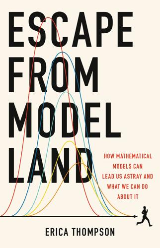
Escape From Model Land: How Mathematical Models Can Lead Us Astray and What We Can Do About It
by Erica Thompson
Published 6 Dec 2022

In principle, you could define a range of plausible conditions for each of these quantifiable unknowns and use them to calculate a range of plausible resting points for the ball after the shot. With luck, when the experiment is tried, the ball would be somewhere near the middle of that range. Physicists would refer to the plausible range as the ‘error bars’ of the calculation; statisticians might call it a ‘confidence interval’. Deep or radical uncertainty enters the scene in the form of the unquantifiable unknowns: things we left out of the calculation that we simply could not have anticipated. Maybe it turns out that the billiards table was actually not a level surface, your opponent was blowing the ball off course or the ball fell into a pocket rather than bouncing off the edge.

pages: 283 words: 81,376

The Doomsday Calculation: How an Equation That Predicts the Future Is Transforming Everything We Know About Life and the Universe
by William Poundstone
Published 3 Jun 2019

It is our historically growing population that gives the doomsday argument its sting. The ongoing growth of computing power leads to worries about control problems or being simulations in someone else’s machine. But all growth spurts must stop sometime. No tree grows to the sky. So-called doomsday predictions come with generously wide error bars. They can be alarming only to those sold on a particular conception of the future—our galactic manifest destiny. Moore’s law, cities on Mars, interstellar probes, and posthuman consciousness are part of many people’s mental furniture. You don’t have to embrace this cultural infrastructure to be influenced by it.

Dinosaurs Rediscovered
by Michael J. Benton
Published 14 Sep 2019

Since 1911, radioisotopic dating has become an important part of laboratory-based geology, with ever more powerful mass spectrometers being deployed. A great strength of the approach is that the same rock can be dated by different means and in different laboratories to cross-check the estimates. There is an extensive international endeavour to improve precision (tightness of the estimate; size of error bars) and accuracy (is it right?) of exact rock dates, and the standard geological time scale is revised in detail every few months, as dates are tuned to be sharper and sharper, and more comparable. When I started my studies of geology in the 1970s, we were told to assume an error of plus or minus 5 per cent on any radioisotopic date.

pages: 404 words: 92,713

The Art of Statistics: How to Learn From Data
by David Spiegelhalter
Published 2 Sep 2019

machine learning: procedures for extracting algorithms, say for classification, prediction or clustering, from complex data. margin of error: after a survey, a plausible range in which a true characteristic of a population may lie. These are generally 95% confidence intervals, which are approximately ±2 standard errors, but sometimes error-bars are used to represent ±1 standard error. mean (of a population): see expectation mean (of a sample): suppose we have a set of n data-points, which we label as x1, x2,…, xn. Then their sample mean is given by m = (x1 + x2 +… + xn)/n, which can be written as . For example, if 3, 2, 1, 0, 1 are the numbers of children reported by 5 people in a sample, then the sample mean is (3 + 2 + 1 + 0 + 1)/5 = 7/5 = 1.4.

pages: 292 words: 92,588

The Water Will Come: Rising Seas, Sinking Cities, and the Remaking of the Civilized World
by Jeff Goodell
Published 23 Oct 2017

I brought up the fact that many scientists believed that we could see six feet or more of sea-level rise by the end of the century, which was twice the IPCC estimates. “Six feet?” the president said, as if hearing the words suddenly made the idea all too real to him. “Yeah,” I said. “As you know, there is some uncertainty in these studies, but the error bars are all in the direction of more sea-level rise than we anticipate, not less.…” “Look, part of my job is to read stuff that terrifies me all the time.” I couldn’t help but laugh, the way he said it. “That’s true, I suppose.” “I’ve got a chronic concern about pandemics, for example. And the odds are that sometime in our lifetime there’s gonna be something like the Spanish flu that wipes out a lot of people… if we’re not taking care.

pages: 442 words: 94,734

The Art of Statistics: Learning From Data
by David Spiegelhalter
Published 14 Oct 2019

machine learning: procedures for extracting algorithms, say for classification, prediction or clustering, from complex data. margin of error: after a survey, a plausible range in which a true characteristic of a population may lie. These are generally 95% confidence intervals, which are approximately ± 2 standard errors, but sometimes error-bars are used to represent ± 1 standard error. mean (of a population): see expectation mean (of a sample): suppose we have a set of n data-points, which we label as x1, x2, …, xn. Then their sample mean is given by m = (x1 + x2 + … + xn)/n, which can be written as . For example, if 3, 2, 1, 0, 1 are the numbers of children reported by 5 people in a sample, then the sample mean is (3 + 2 + 1 + 0 + 1)/5 = 7/5 = 1.4.

pages: 340 words: 91,416

Lost in Math: How Beauty Leads Physics Astray
by Sabine Hossenfelder
Published 11 Jun 2018

Atomic nuclei are luckily stable, but take the neutron out of the nucleus and that neutron will decay, with an average lifetime of about 10 minutes. More precisely, 885 seconds plus or minus 10. The curious part is the plus or minus. FIGURE 15. Neutron lifetime measurements by year. Sources: Patrignani C et al. (Particle Data Group). 2016. “Review of particle physics.” Chin Phys C 40:100001. (Error bars are 1σ.) Bowman JD et al. 2014. “Determination of the free neutron lifetime.” arXiv:1410.5311 [nucl-ex]. The neutron’s lifetime has been measured with steadily increasing accuracy starting in the 1950s (Figure 15, left). Presently there are two different measurement techniques, which yield different results (Figure 15, right).

pages: 353 words: 101,130

Schild's Ladder
by Greg Egan
Published 31 Dec 2003

Given time, Tchicaya would have happily observed the Colonists from a distance until everything about them, right down to the subtlest cultural nuance, was absolutely clear. He and Mariama could have descended from the sky expecting compliments on their perfect local accents and unprecedented good manners, like a pair of conscientious travelers. It was not going to happen that way. The coming of the Planck worms would be unheralded, but the five percent error bars of the toolkit's best statistical guess had already been crossed. If the sky rained poison right now, as they rushed through their rudimentary preparations, they would not even have the bitter consolation of knowing that they'd been ambushed by unforeseeable events. They'd reached the end game, ready or not.

pages: 375 words: 102,166

The Genetic Lottery: Why DNA Matters for Social Equality
by Kathryn Paige Harden
Published 20 Sep 2021

“Sib-regression” method estimates heritability by leveraging random variation among sibling pairs in extent of identity-by-descent sharing. “RDR” (relatedness disequilibrium regression) method extends the sib-regression method to other pairs of relatives, where the relatedness of the pair is conditioned on the relatedness of their parents. Error bars represent standard errors. All heritability estimates drawn from Alexander I. Young et al., “Relatedness Disequilibrium Regression Estimates Heritability without Environmental Bias,” Nature Genetics 50, no. 9 (September 2018): 1304–10, https://doi.org/10.1038/s41588-018-0178-9, except for twin estimate of heritability for educational attainment, which is drawn from Amelia R.

Calling Bullshit: The Art of Scepticism in a Data-Driven World
by Jevin D. West and Carl T. Bergstrom
Published 3 Aug 2020

For example, you could use the Kelvin scale, for which absolute zero has a natural physical meaning independent of human cultural conventions. *7 An apocryphal story relates that when asked “Why did you rob all those banks?” the legendary bank robber Willie Sutton replied, “Because that’s where the money is.” *8 Moreover, the error bars show the standard deviation of the mean, not the standard deviation of the observations. Thus they do not directly represent the dispersion of the points within the bin, but rather our uncertainty about a bin’s mean value. This display choice exacerbates the misimpression that the data series forms a tight trend where genetic score is highly predictive of educational attainment

pages: 350 words: 107,834

Halting State
by Charles Stross
Published 9 Jul 2011

And this time you’ve got the speech-stress monitor on real time, just out of curiosity. “I’m sorry, I haven’t,” he says, and he’s telling the truth, dammit. “Do you know where they’ve gone?” you ask. “I’m sorry, but no. They haven’t been in all day.” He frowns pensively. “That’s odd, now you mention it.” He’s green-lit within the error bars, all the way: telling the truth again. How inconvenient. “They were running some sort of database trawl overnight, I think. They demanded access to a lot of rather sensitive data yesterday evening and left a big batch job running.” “What kind of data were they after?” you ask, just cross-referencing in case it spooks Wayne into putting a foot wrong.

pages: 407 words: 108,030

How to Talk to a Science Denier: Conversations With Flat Earthers, Climate Deniers, and Others Who Defy Reason
by Lee McIntyre
Published 14 Sep 2021

What is the basis (and weakness) of their reasoning strategy? For one thing, their insistence on proof is based on a complete misunderstanding of how science works. With any empirical hypothesis, it is always possible that some future piece of evidence might come along to refute it. This is why scientific pronouncements customarily come with errors bars; there is always some uncertainty to scientific reasoning. This does not, however, mean that scientific theories are weak—or that until all of the data are in, any alternative hypothesis is just as good as a scientific one. In science, all of the data are never in! But this does not mean that a well-corroborated scientific theory or hypothesis is unworthy of belief.

pages: 421 words: 120,332

The World in 2050: Four Forces Shaping Civilization's Northern Future
by Laurence C. Smith
Published 22 Sep 2010

Both books provide very accessible introductions to the physics of climate and climate change. 35 The analogy to a closed car or glass greenhouse is imperfect because air circulation is not trapped in a moving atmosphere, but it’s close enough for our purposes here. 36 Svante Arrhenius, “On the Influence of Carbonic Acid in the Air upon the Temperature of the Ground,” Philosophical Magazine and Journal of Science, 5th Series 41 (April 1896): 237-276. 37 For more about Arrhenius and other early research on the greenhouse effect, see R. Henson, The Rough Guide to Climate Change (London: Penguin Books Ltd., 2008). 38 From global weather station data, the average hundred-year linear trend from 1906 to 2005 is +0.74°C (with error bars, between +0.56°C and +0.92°C). From air bubbles trapped in ice cores, we know atmospheric CO2 concentrations averaged ~280 ppm in the preindustrial era (before ~1750 A.D.) versus ~387 ppm in 2009. The first continuous direct sampling of CO2 concentration was begun by Charles “Dave” Keeling at Mauna Loa Observatory in 1958 and continued by his son Ralph Keeling.

pages: 412 words: 122,952

Day We Found the Universe
by Marcia Bartusiak
Published 6 Apr 2009

“While the recent revival of the notion that spiral nebulae are mere distant constellations has not seemed to me to have any substantial basis, it is a satisfaction to feel that definite evidence is about to give it a quietus,” he responded. Van Maanen was aware that his work “might indicate that these bodies are not as distant as is usually supposed to be the case,” but he kept that speculation out of his early reports. That's partly because in 1917 he measured a rotation for the Andromeda nebula with error bars larger than his result. “So that we do not know yet if this is an island universe!” he told Hale. But that was the exception. Van Maanen primarily got the answer that many expected: Spiral nebulae exhibited internal motions and so must be relatively nearby. Moreover, the announcement was being made by a widely respected astronomer working at the world's premier observatory, whose expertise in stellar measurements was lauded.

pages: 351 words: 123,876

Beautiful Testing: Leading Professionals Reveal How They Improve Software (Theory in Practice)
by Adam Goucher and Tim Riley
Published 13 Oct 2009

When your fuzz testing stops finding bugs, it’s time to start using the more advanced features of your fuzzer to make your testing effective once again. With a lot of the general problems fixed, I was able to find bugs in more localized functions by decreasing the fuzzing ratio. This change made it easier to find more specific bugs, including those in minor spreadsheet elements like chart error bars and particular plot types. Finding these bugs is encouraging because it signals that your code is becoming more stable and is allowing the altered input to get further into the importers and exporters. By monitoring the results of fuzz testing, you can gather a great amount of feedback about the stability of the code you’re testing and the effectiveness of the fuzzing.

pages: 381 words: 120,361

Sunfall
by Jim Al-Khalili
Published 17 Apr 2019

If it is altered so as to predict that the charginos will decay back into neutralinos more quickly than is really the case then the energy of the beams, the speed of the particles, will be adjusted to suit the prediction, and the beam will still consist of charged particles when it hits the ground.’ Sarah shook her head. ‘I still don’t get it. Why calculate lifetimes during the run itself? Why not hardwire these numbers into the accelerator design in advance?’ ‘Because then we would have no control. The energy and luminosity of the beams will always have tiny error bars and so all parameters have to be constantly adjusted. Remember, for the run to work, all eight beams need to coincide, and these particles are travelling at close to the speed of light. There is no margin for error.’ ‘OK, so it doesn’t work. We’d just try again, right? Once we know, it can be corrected again.’

Software Design for Flexibility
by Chris Hanson and Gerald Sussman
Published 17 Feb 2021

But this discrepancy does not damage other Hipparcos measurements. 6 This is why we fudged Gatewood and de Jonge's measurement. Their result would not overlap with the Hipparcos result if we quoted it correctly. In fact, the Hipparcos measurement would be entirely contained in the Gatewood and de Jonge error bars. 7 This admittedly weird system descends from the work of the ancient Greek astronomer Hipparchus (c. 190 BCE – c. 120 BCE). He assigned a numerical brightness to each star in his catalog. He called the brightest stars first magnitude, less bright ones second magnitude, and the dimmest sixth magnitude.

pages: 398 words: 31,161

Gnuplot in Action: Understanding Data With Graphs
by Philipp Janert
Published 2 Jan 2010

You can always come back to this chapter when you need a specific plot type. 67 68 5.1 CHAPTER 5 Doing it with style Choosing plot styles Different types of data call for different display styles. For instance, it makes sense to plot a smooth function with one continuous line, but to use separate symbols for a sparse data set where each individual point counts. Experimental data often requires error bars together with the data, whereas counting statistics call for histograms. Choosing an appropriate style for the data leads to graphs that are both informative and aesthetically pleasing. There are two ways to choose a style for the data: inline, as part of the plot command, or globally, using the set style directive.

pages: 478 words: 142,608

The God Delusion
by Richard Dawkins
Published 12 Sep 2006

The seven include the number of stars, the number of Earth-like planets per star, and the probability of this, that and the other which I need not list because the only point I am making is that they are all unknown, or estimated with enormous margins of error. When so many terms that are either completely or almost completely unknown are multiplied up, the product – the estimated number of alien civilizations – has such colossal error bars that agnosticism seems a very reasonable, if not the only credible stance. Some of the terms in the Drake Equation are already less unknown than when he first wrote it down in 1961. At that time, our solar system of planets orbiting a central star was the only one known, together with the local analogies provided by Jupiter’s and Saturn’s satellite systems.

pages: 1,829 words: 135,521

Python for Data Analysis: Data Wrangling with Pandas, NumPy, and IPython
by Wes McKinney
Published 25 Sep 2017

Let’s look now at the tipping percentage by day with seaborn (see Figure 9-19 for the resulting plot): In [83]: import seaborn as sns In [84]: tips['tip_pct'] = tips['tip'] / (tips['total_bill'] - tips['tip']) In [85]: tips.head() Out[85]: total_bill tip smoker day time size tip_pct 0 16.99 1.01 No Sun Dinner 2 0.063204 1 10.34 1.66 No Sun Dinner 3 0.191244 2 21.01 3.50 No Sun Dinner 3 0.199886 3 23.68 3.31 No Sun Dinner 2 0.162494 4 24.59 3.61 No Sun Dinner 4 0.172069 In [86]: sns.barplot(x='tip_pct', y='day', data=tips, orient='h') Figure 9-19. Tipping percentage by day with error bars Plotting functions in seaborn take a data argument, which can be a pandas DataFrame. The other arguments refer to column names. Because there are multiple observations for each value in the day, the bars are the average value of tip_pct. The black lines drawn on the bars represent the 95% confidence interval (this can be configured through optional arguments).

pages: 469 words: 142,230

The Planet Remade: How Geoengineering Could Change the World
by Oliver Morton
Published 26 Sep 2015

The latest IPCC assessment, taking all this into account, reports that the net effects of anthropogenic aerosols, including the warming caused by sooty ones, the cooling caused by shiny ones and the various interactions with clouds, add up to about one watt per square metre of cooling – roughly half the forcing due to carbon dioxide. The error bars on that number are similar in size to the number itself, meaning that the possible net effect could be as little as 0.1 watts per square metre or as much as 1.9 watts per square metre. This means that it is possible that more than half of the warming due to carbon dioxide is currently being masked by cooling due to aerosols, though it is also possible that only a little is.

pages: 205 words: 18,208

The Transparent Society: Will Technology Force Us to Choose Between Privacy and Freedom?
by David Brin
Published 1 Jan 1998

Moreover, the Net can also provide many of the implements of science, analytical projection software and statistical tools drawing on vast databases, enabling advocates to create detailed models of their proposals—and their opponentsʻ—for presentation in the arena. This will be crucial because, as University of California at San Diego Professor Phil Agre has pointed out, much of the “data” being bandied about on the Net these days is of incredibly poor quality, often lacking provenance or any trace of error bars, sensitivity, dependency, or semantics. These problems can only be solved the way they are handled in science, by unleashing people with the personalities of bull terriers—critics who could be counted on to pull apart every flaw until they are forced to admit (with reluctance) that they canʼt find any more.

pages: 576 words: 150,183

Project Hail Mary
by Andy Weir
Published 15 May 2021

Tau Ceti itself sits at the center, denoted with the Greek letter tau. Ohhhh…that’s what the lowercase t is on the Hail Mary crest. It’s a tau, for “Tau Ceti.” Okay. Anyway, four planetary orbits are shown as thin white ellipses around the star. The locations of the planets themselves are shown as circles with error bars. We don’t have super-accurate information on exoplanets. If I could figure out how to get the science instruments working, I could probably get much better info on those planet locations. I’m twelve light-years closer to them than astronomers on Earth. A yellow line runs almost directly into the system from off-screen.

pages: 648 words: 170,770

Leviathan Wakes
by James S. A. Corey
Published 14 Jun 2011

Of course, if one of the increasingly frequent strikes hit him, it would be a lot like getting shot, so waiting around wasn’t a good solve either. He put both dangers out of his mind and did the work. For ten nervous minutes, his suit smelled of overheating plastic. All the diagnostics showed within the error bars, and by the time the recyclers cleared it, his air supply still looked good. Another little mystery he wasn’t going to solve. The abyss above him shone with unflickering stars. One of the dots of light was Earth. He didn’t know which one. The service hatch had been tucked in a natural outcropping of stone, the raw-ferrous cart track like a ribbon of silver in the darkness.

Atomic Accidents: A History of Nuclear Meltdowns and Disasters: From the Ozark Mountains to Fukushima
by James Mahaffey
Published 15 Feb 2015

In those early decades of nuclear power, it was an unwritten rule in the AEC that the public was not to be burdened with radiation release figures or the mention of minor contamination. It was true that the general population had no training in nuclear physics and radiation effects, and if given numbers with error bars and a map of an airborne radiation plume, imaginations could take control in nonproductive ways. Nobody wanted to cause a panic or unwarranted anguish or to undermine the public’s fragile confidence in government-sponsored research. The results of such a policy are worse than what it is trying to forestall, as the government is commonly accused of purposefully withholding information, and misinformation rushes in to fill the vacuum.

pages: 676 words: 203,386

The Platinum Age of Television: From I Love Lucy to the Walking Dead, How TV Became Terrific
by David Bianculli
Published 15 Nov 2016

Published in the United States by Doubleday, a division of Penguin Random House LLC, New York, and distributed in Canada by Random House of Canada, a division of Penguin Random House Limited, Toronto. www.doubleday.com DOUBLEDAY and the portrayal of an anchor with a dolphin are registered trademarks of Penguin Random House LLC. Cover design by Michael J. Windsor Cover images: digital glitch © Igorstevanovic / Shutterstock; error bars © Admirolas / Shutterstock; T.V. snow © Shutterstock; test pattern © Donald Sawvel / Shutterstock All photos are from the author’s personal collection. LIBRARY OF CONGRESS CATALOGING-IN-PUBLICATION DATA Names: Bianculli, David, author. Title: The platinum age of television : from I love Lucy to The walking dead, how TV became terrific / David Bianculli.